
How Abstract Art Shapes Workspace Psychology — What the Research Shows
Share
How Abstract Art Shapes Workspace Psychology — What the Research Actually Shows
Abstract art in the workplace is not about decoration. It is about cognitive environment. The painting on the wall is doing something to the brain of every person in the room — and the research on what exactly that "something" is has become impossible for commercial designers to ignore.
The Science of Looking
When someone encounters an abstract painting, their brain engages differently than with a photograph or a figurative image. There is no immediate narrative to settle into, no subject to identify and move past. Instead, the mind enters a state of sustained visual inquiry — searching for pattern, rhythm, and meaning that is never fully resolved.
Studies in neuroaesthetics — the neuroscience of aesthetic experience — have demonstrated that abstract art activates the brain's default mode network, the same system engaged during introspection, creative thinking, and problem-solving. In other words: looking at abstract art puts the brain into a state that is receptive to insight.
What This Means for Workspaces
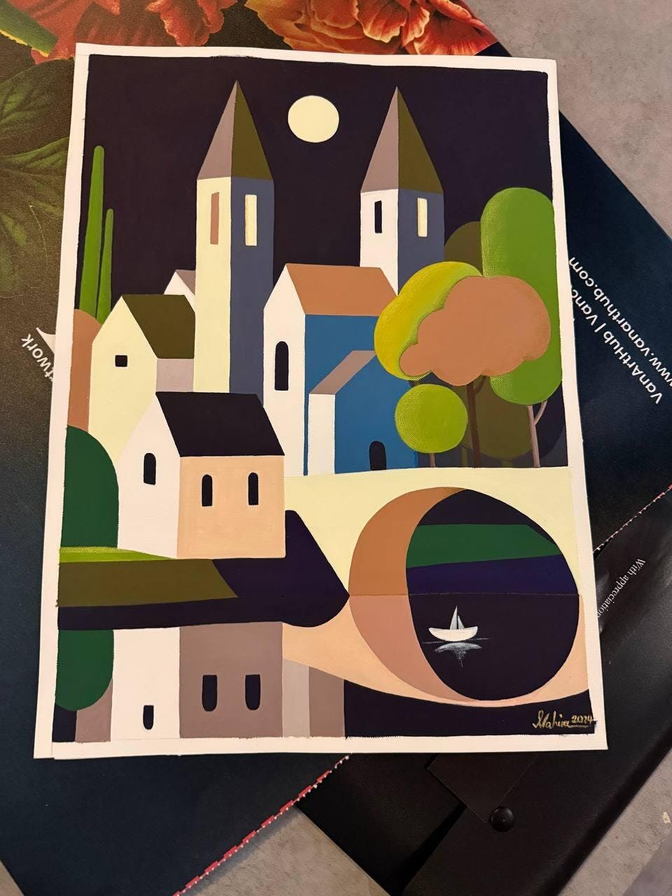
An abstract painting in a conference room is not passive. It is shaping the cognitive register of every meeting that happens in front of it. A bold, gestural work — like the large-scale canvases of Melina Ghaemi — introduces energy and unpredictability. A calmer, layered composition — like the spiritual abstractions of Roshan — invites reflection and patience.
The choice of abstraction is a choice about how the room should feel. Not what it should say — abstract art says nothing literal — but what psychological state it should support.
Composition, Colour, and Cognitive Effect
Bold, high-contrast abstracts (heavy blacks, saturated reds, sharp diagonals) increase alertness and energy. They belong in creative studios, pitch rooms, and spaces where high-intensity thinking is the norm. The risk: over time, highly agitated compositions can contribute to cognitive fatigue. Rotate these pieces periodically.
Soft, layered abstracts (muted blues, earth tones, organic forms) promote calm focus. They work in private offices, wellness rooms, and spaces dedicated to deep work. These paintings don't demand attention — they create an atmosphere of sustained concentration. See Fine Art Paintings for examples.
Structural, geometric abstracts (clean lines, balanced composition, deliberate colour fields) signal order and precision. They suit boardrooms, legal offices, and financial environments. The order in the painting reinforces the order expected in the work. Browse Contemporary Art for architectural abstraction.
The Commercial Argument
Companies that invest in original abstract art are making a choice about employee experience that goes deeper than aesthetics. They are choosing environments that support how the brain actually works — not just how it looks in a brochure photo. For organizations competing on innovation, creative output, and strategic thinking, the cognitive environment is not a luxury. It is infrastructure.
Explore Office Art and Art for Interior Designers for curated selections organized by workspace intent.
Frequently Asked Questions
Does abstract art actually improve workplace productivity?
Research in neuroaesthetics and environmental psychology suggests that thoughtfully chosen abstract art improves cognitive flexibility, creative problem-solving, and subjective well-being in workplace environments. The effect is not mechanical — you won't measure a 12% productivity gain — but sustained exposure to original art correlates with higher employee satisfaction and perceived workspace quality.
What if my team finds abstract art intimidating or confusing?
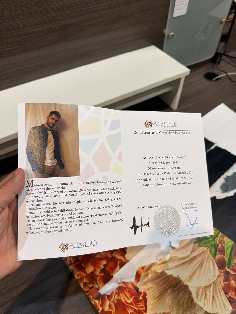
This is common and addressable. Provide context: a brief artist bio, a sentence about the work's intention. When people understand that abstract art is not a puzzle to solve but an atmosphere to inhabit, resistance typically dissolves. VanArtHub includes artist statements with every work to support this kind of contextual introduction.
Should abstract art in the office match the brand colours?
It can, but the strongest approach is a deliberate relationship rather than a literal match. An artwork that uses complementary or analogous colours to the brand palette creates visual coherence without becoming a branded object. The art should feel like it belongs in the space, not like it was ordered from the marketing department.