Neutral Modern Wall Art

Original abstract and fine art paintings in muted beige, grey, earth, white and charcoal palettes, hand-painted and signed, made to hold a calm room together.

Will neutral art work in a room that already has strong colour?

Yes, and that is often where neutral art does the most work: in a room with bold furniture, a patterned rug, or a painted accent wall, a muted painting gives the eye a place to rest and lets the loud pieces stay loud.

Not every room needs a statement. Some spaces ask for presence without volume, art that settles into the interior instead of announcing itself. This collection gathers original abstract and fine art paintings in beiges, greys, earth tones, soft whites and charcoal, chosen for rooms built around calm: the living room where conversations happen, the bedroom that puts rest first, the office where focus matters more than flourish. Every piece is hand-painted, signed, and the only one of its kind, and you have 14 days at home to see how it sits against the colours you already own.

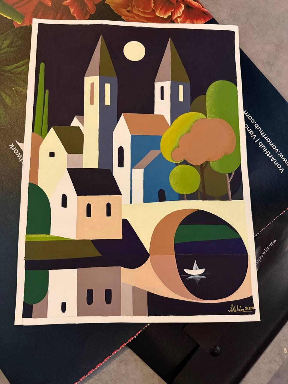
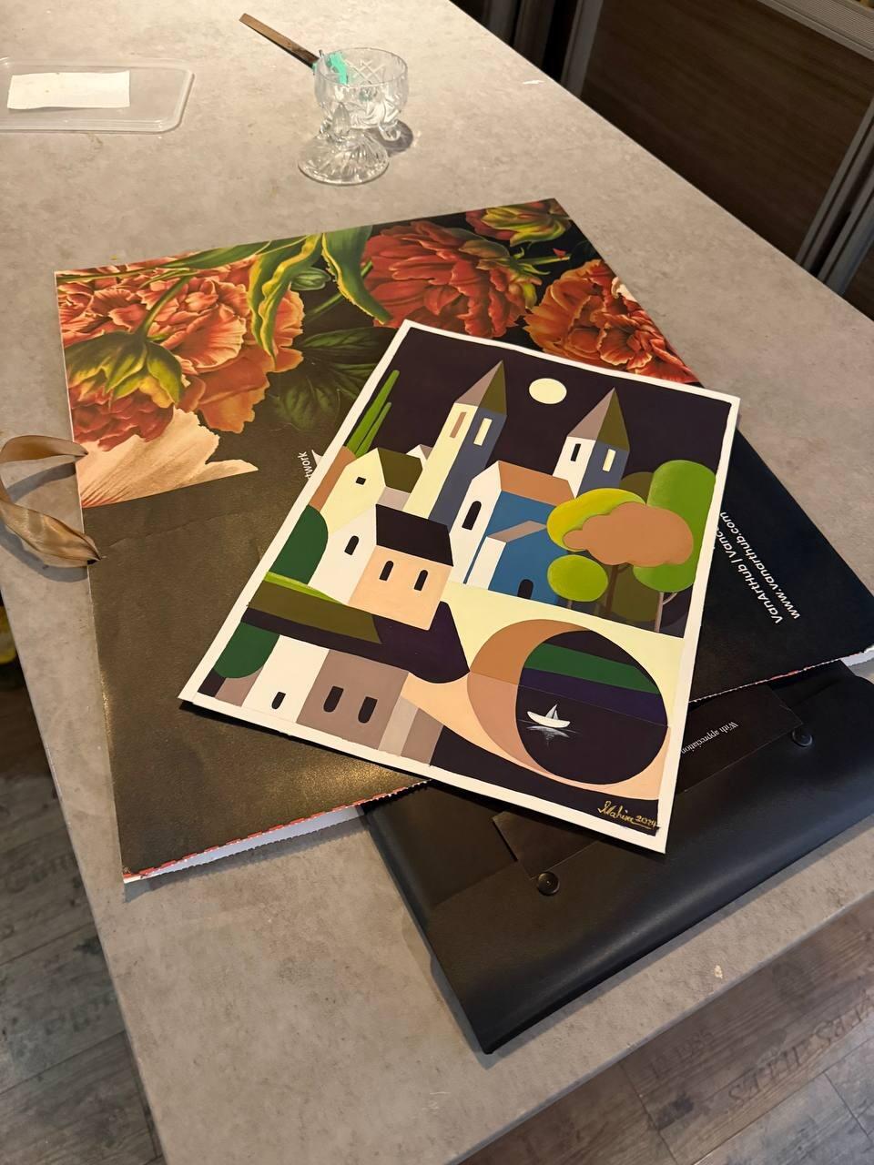
Dance of the Ocean: Original Oil on Canvas by Nahira | VanArtHub, an original painting in the Neutral Modern Wall Art collection
Dance of the Ocean: Original Oil on Canvas by Nahira | VanArtHub · $1,084.00

What counts as neutral modern wall art?

Neutral modern wall art is contemporary work painted in whites, creams, beiges, greys, browns, and blacks, sometimes warmed with soft gold or bronze. The style leans abstract or loosely figurative, and the palette stays quiet on purpose: these are paintings built to live with other things, not to shout over them. Our black and white and neutral art sits at the cool end of this range, and our beige and cream paintings at the warm end. Every one is a hand-painted original, which matters more in this category than any other, for a reason we get to below.

Should you choose warm or cool neutrals?

Choose warm neutrals for rooms built around wood and natural fibres, and cool neutrals for rooms built around stone, steel, and crisp white walls. Undertone is the whole game. A cream painting against a grey sofa can look yellowed; a grey painting against oak floors can look cold. Match the undertone of the room's biggest surfaces, then let the painting vary in depth rather than hue.

PaletteUndertonePairs naturally withFeels like
Warm neutrals (cream, sand, taupe, umber)Yellow and redOak, walnut, linen, terracotta, brassSettled, soft, candle-lit
Cool neutrals (white, grey, charcoal, black)BlueMarble, concrete, chrome, glassCrisp, architectural, calm
Fractured Harmony: Original Acrylic on Canvas by Peyman Mehdizadeh | VanArtHub, an original painting in the Neutral Modern Wall Art collection
Fractured Harmony: Original Acrylic on Canvas by Peyman Mehdizadeh | VanArtHub · $1,446.00

How does texture carry a painting when colour is quiet?

When colour steps back, texture does the talking, and this is where original paintings separate from printed decor completely. Knife-built impasto, layered washes, scraped-back grounds: in a neutral work these surface decisions are the entire subject, and light moving across them through the day is what keeps the piece alive. A printed neutral canvas is a flat beige rectangle. We will also admit the honest failure mode of this style: a smooth, low-texture neutral painting in an all-neutral room can simply disappear. If your walls, sofa, and rug are already quiet, choose the most textured work you can find, or a piece with strong tonal contrast. The technical terms are explained in our art glossary if impasto and glazing are new words.

What materials pair best with neutral art?

Wood, stone, and linen are the natural partners, because neutral painting borrows its palette from exactly those materials. A sand-toned abstract over a white oak console reads as one composed thought. Earth-dark work from our brown paintings grounds a pale linen sofa. One practical warning from the people who pack these crates: neutrals are the hardest colours to judge on a screen, because every monitor renders beige differently. This is the category where our 14-day home trial earns its keep. Hang the painting beside your actual wood and your actual linen for two weeks, and if the undertone fights the room, send it back for a full refund with return shipping on us.

Frequently asked questions

My whole room is already beige. Do you still recommend neutral art?

Often we talk people out of it. A third layer of beige on a beige wall above a beige sofa leaves nothing for the eye to stop on, and no amount of texture rescues that. In that room we point buyers toward a neutral with a genuinely dark or warm anchor in it, or toward one piece with real colour. Send a photo and we will say plainly which way we would go.

Is it better to hang one large neutral painting or two smaller ones?

One larger piece, in most rooms. Neutral work carries less contrast, so it needs size to hold a wall, and two small quiet canvases usually look like clutter rather than a pair. Sizes here run from about 30 by 40 cm up to about 135 cm wide and 152 cm tall. We only suggest a pair when the wall is broken by a switch, a vent or a doorway.

What if the painting looks too warm or too cool in my light?

Send it back. Neutrals shift more than any other work under home lighting, and a piece that looked grey on a screen can look pink under warm bulbs at night. That is exactly what the 14-day trial is for. Keep it up for a few evenings, and if the temperature is wrong, return it within 14 days for a full refund with return shipping paid by us.

What are these neutral pieces actually painted in?

Almost all of them are oil or acrylic on stretched canvas. That matters for neutral work, because the interest has to come from surface and brush marks rather than colour, and canvas holds that texture where a smooth print cannot. The work here comes from Melina Ghaemi, Roshan, Phaedra, Nahira, Ziba Vishteh, Peyman Mehdizadeh and Marjan Mousavi, each with a different way of building that surface.

Can I order the same neutral painting again for a second room?

No. Every piece is a one of a kind original, hand painted and signed, so there is never a second copy and we do not sell prints of them. What we can do is ask the artist for a companion piece in a similar size and palette, made as a new original rather than a copy. That takes time to paint, so start the conversation early.

What does a large neutral canvas cost compared with a small one?

Across this collection prices run from about $80 to about $3,000, with the middle near $1,100, and size is the strongest driver. A small canvas near 30 by 40 cm sits at the bottom of that range, while a piece close to 135 cm wide sits near the top. Medium matters too, since oil work here usually costs more than acrylic of the same size.

What is the difference between warm and cool neutrals?

Warm neutrals lean toward yellow, red, and brown, such as cream, sand, oatmeal and taupe, while cool neutrals lean toward blue and green, such as grey, stone, dove and blue-based greige. Hold the painting next to your wall in daylight and a mismatch shows immediately, because a cream canvas against a cool grey wall makes both look dirty.

How do I match neutral art to my wall paint?

Do not match it, offset it by two or three steps on the same temperature: a sand painting on a pale oatmeal wall, or a charcoal-grey work on a dove-grey wall. An exact match makes the painting vanish. Take a photo of your wall in morning light and again at night, then compare it with the artwork images before you buy.

Is neutral art cheaper than colourful art?

No, neutral work costs the same as colourful work of the same size and medium, and good neutral painting is often harder to make. With no strong colour to carry the piece, the artist has to make it work through texture, edges, and value alone. Our smallest neutral originals start around $72, and larger textured pieces run into the hundreds and up.

Does neutral art need to be bigger to have presence?

Yes, plan on about 20 percent more width than you would give a bold colourful piece on the same wall, because quiet colour needs area to register. A 60 cm neutral canvas on a wide wall disappears, while the same wall takes a 100 to 120 cm neutral comfortably. Grouping two or three neutral works in one block also solves it.

How do artists make a painting interesting with almost no colour?

They work with surface instead of colour: thick and thin paint side by side, matte next to gloss, scraped areas against built-up ridges, and cloth or plaster mixed into the ground. Value contrast does the rest, moving from near white to deep charcoal. Stand at an angle to a good neutral painting and you will see the whole composition change.

Do pale neutral paintings show dust and marks more than dark ones?

Yes, pale surfaces show dust along the top edge and any greasy fingerprint on the canvas, so handle them by the stretcher bars and dust the top edge every couple of months with a dry brush. The upside is that pale paintings hide the fine scratches that show badly on dark gloss. Neither type needs cleaning products, and both hate them.

When does neutral art make a room feel flat?

Neutral art falls flat in a room that is already all neutral, with a beige sofa, oak floor, cream walls, and linen curtains. Add a fifth quiet element and the room reads as unfinished rather than calm. In that case buy one piece with real depth of tone or heavy texture, or accept that this room wants colour and buy accordingly.

Frequently Asked Questions

What defines neutral wall art?

Art that uses a restrained palette, beiges, greys, whites, earth tones, charcoal, and compositions that integrate into interiors rather than competing with them. Neutral does not mean boring; it means the art supports the room's atmosphere.

Will neutral art work in a colourful room?

Yes. Neutral art provides visual rest in spaces with bold furniture or accent walls. It creates balance, a point of visual calm that allows other design elements to lead.

Can neutral art still have texture and depth?

Absolutely. Original oil and acrylic paintings carry surface texture, impasto, glazing, visible brushwork, that mass-produced neutral prints cannot replicate. The depth is in the surface, not just the palette.