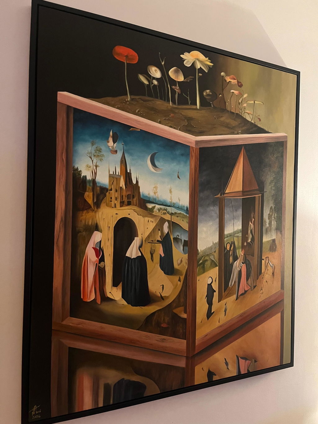
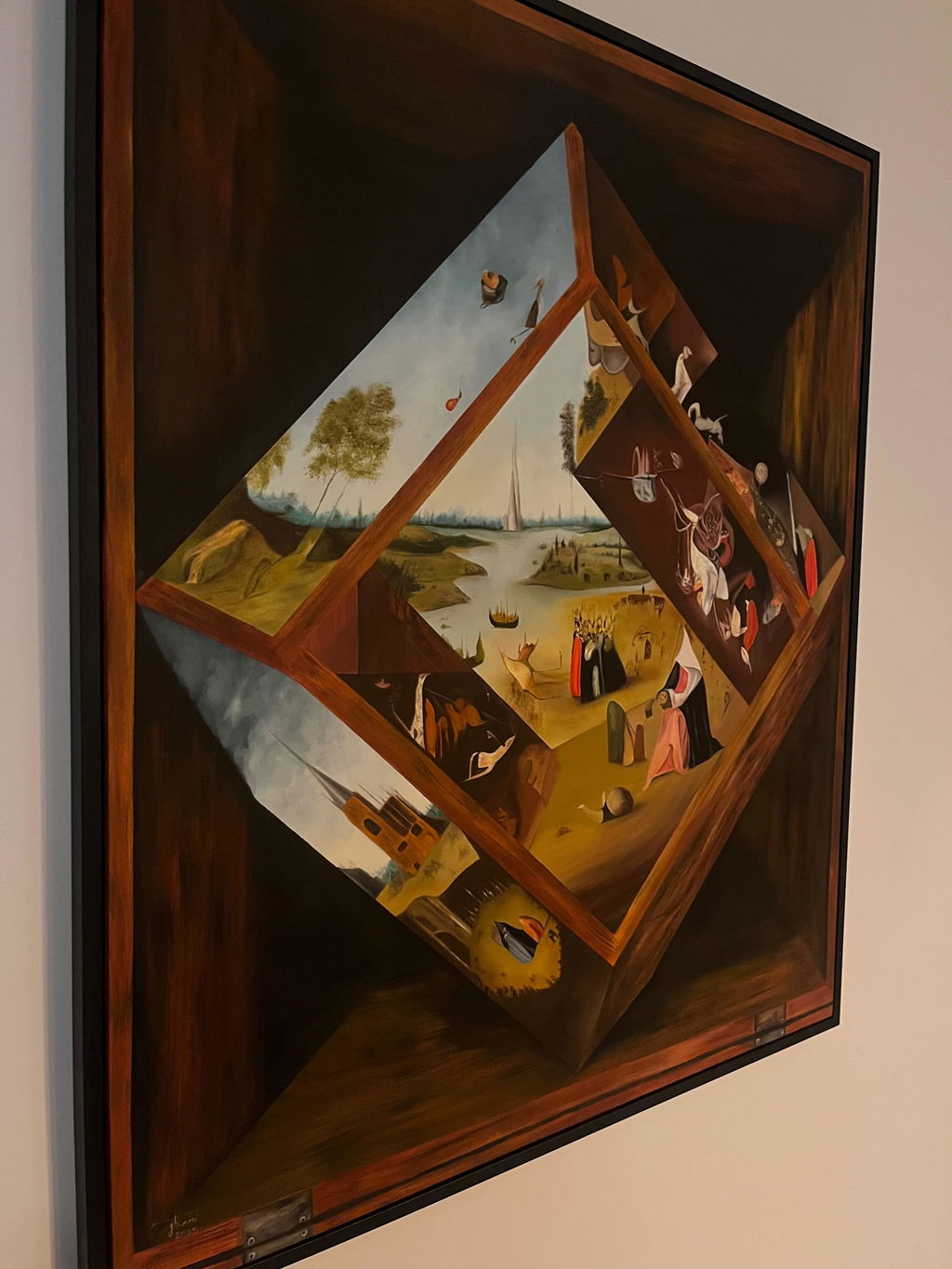
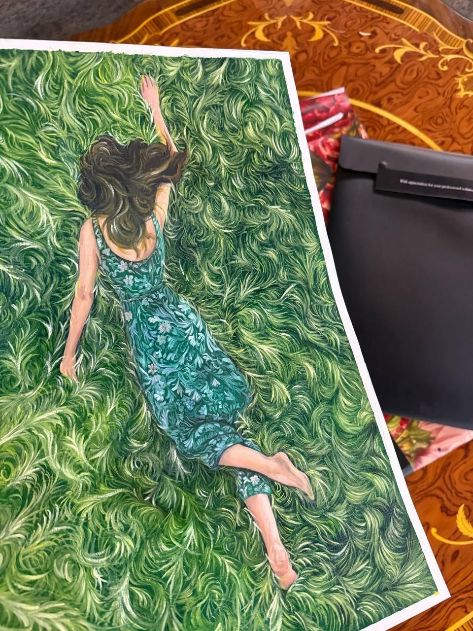
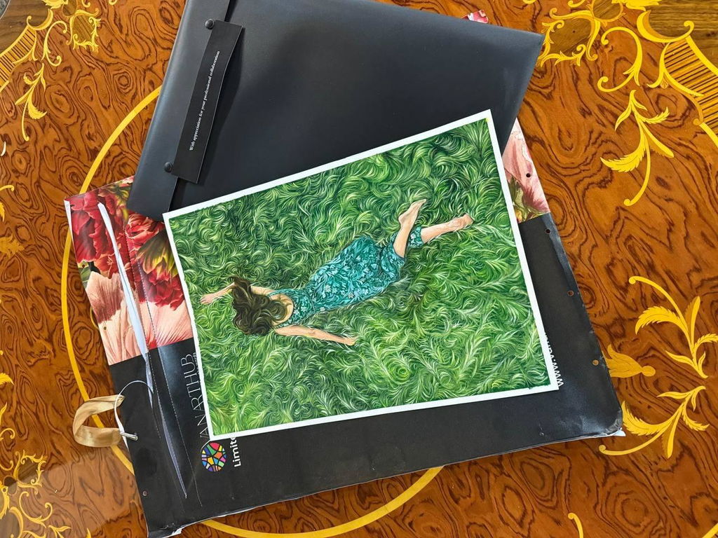
The mat does more for how a framed picture looks than the frame does, and it is the part people think about least. Two pieces in identical mouldings, one with a narrow mat and one with a generous one, look like they came from different worlds.
There are three rules. All of them are about proportion, and none of them are difficult.
Rule 1: wider than you think
A narrow mat reads as an accident. A generous one reads as a decision. If you are unsure, go wider.
Useful starting points, for a mat on a work on paper:
| Artwork longest side |
Border, as a start |
| Under 200 mm |
50 to 60 mm |
| 200 to 400 mm |
60 to 80 mm |
| 400 to 600 mm |
80 to 100 mm |
| Over 600 mm |
100 mm and up |
Note that the border does not scale in proportion to the artwork. A small piece gets a border that is enormous relative to the image, and that is exactly right: the mat is what gives a small work presence. A small drawing in a 25 mm mat looks like a postcard. The same drawing in a 60 mm mat looks like a work of art. Nothing changed except the empty space around it.
Rule 2: the mat should be wider than the frame
If the moulding is 30 mm wide, the mat should be more than 30 mm. When the frame is wider than the mat, the eye reads the frame as the dominant element and the artwork gets squeezed between two heavy borders.
This one rule fixes most bad framing you see. It is also the reason a very wide ornate frame needs a very wide mat or no mat at all, never a thin one.
Rule 3: weight the bottom
Cut all four borders equally and the picture will look like it is sliding downwards. This is not a superstition, it is how vision works: the eye reads the optical centre of a rectangle as slightly above the true geometric centre.
The correction is to make the bottom border deeper, by about 20 percent. On an 80 mm border, that means 80 mm on the top and sides and about 96 mm at the bottom.
Measured, it is uneven. Looked at, it is centred. Every gallery you have been in does this and you have never noticed, which is the point.
How much to add is a matter of degree. Ten percent is subtle and safe. Twenty percent is the classic. More than about 30 percent starts to look deliberate, which is a legitimate choice for a formal piece and wrong for a casual one.
Where the rules bend
A group hung together
If several pieces hang as a set, consistency across the group matters more than the ideal border on each. Usually that means matting them all to the same outer size, with the borders varying to accommodate different image sizes. See gallery wall frame sizing.
Very wide or very tall images
A panoramic image in an equal border looks stretched. Narrowing the borders on the long sides slightly, relative to the short ones, brings it back. This is judgement rather than arithmetic.
Work where the paper is part of the piece
A deckled edge or a visible plate mark should be seen, not covered. That means a float mount rather than a window mat. See double mats and fillets for the related question of a second reveal.
Colour
White, off-white, or cream, almost always. The mat's job is to separate the artwork from the wall and give the eye somewhere to rest, and a coloured mat stops doing that and starts competing.
The specific choice is between a cool white and a warm cream, and it should follow the paper. Hold the mat against the artwork's own margin: if the mat makes the paper look yellow, the mat is too cool. If it makes the paper look grey, the mat is too warm.
A coloured mat pulled from the artwork can work, and it dates faster than anything else in framing. If you want a colour accent, that is what a fillet or a double mat reveal is for.
Do the arithmetic
The frame and mat calculator applies all three rules and draws the result to scale, including the weighted bottom border, so you can see the proportions before committing.
Common questions
Can a mat ever be too wide?
Yes, though it happens far less often than too narrow. Past a certain point the artwork starts to look marooned, and the framed object becomes mostly empty board. On a small work you can go a long way before that happens. On a large one the limit arrives sooner.
Does a canvas need a mat?
No. A stretched canvas is not glazed and is not matted. Matting belongs to works on paper and board. See floater frames for canvas.
Should the mat match the wall colour?
No. The mat separates the artwork from the wall, and matching the wall removes the separation entirely. Match the mat to the paper, and let the frame handle the relationship with the wall.
What is a standard mat width for a mid-size print?
Around 6 to 8 cm is a common, safe starting point for a print roughly 30 to 50 cm on its longer side, giving the image room to breathe without dominating the wall space around it. Smaller or larger pieces scale up or down from there rather than sticking to one fixed number.
Should the mat be wider at the bottom than the sides?
Often, yes, by a small amount, usually 5 to 10 percent more at the bottom than the top and sides. This is a traditional optical correction: an equal-width mat can make the image look like it is sliding down within the frame, and a slightly deeper bottom border corrects that illusion.
Does mat width change with the frame's own width?
It should be considered together. A wide, heavy moulding paired with a very narrow mat can make the frame feel like it is squeezing the image, while a wide mat balances a substantial frame nicely. We look at both together when we design the mat for a piece rather than picking mat width in isolation.
Can I request an unusually wide mat on purpose?
Yes, and it is a deliberate, common look for smaller or more delicate pieces, sometimes called a museum mat or an oversized mat. A very wide border isolates the artwork visually, similar to how a piece is displayed in a museum case. It costs a little more in board and outer frame size, not in labour.
What is the minimum mat width you would ever recommend?
Around 3 to 4 cm, mainly for structural reasons: a mat narrower than that leaves too little board to safely support a hinge and to hold its shape at the corners. Below that width, we would usually suggest a spacer and no visible mat at all rather than a mat too thin to do its job.