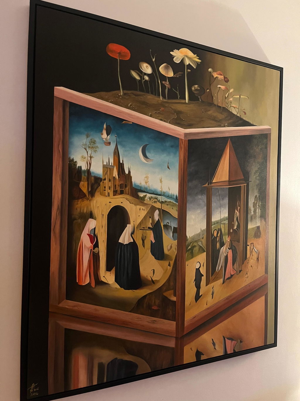
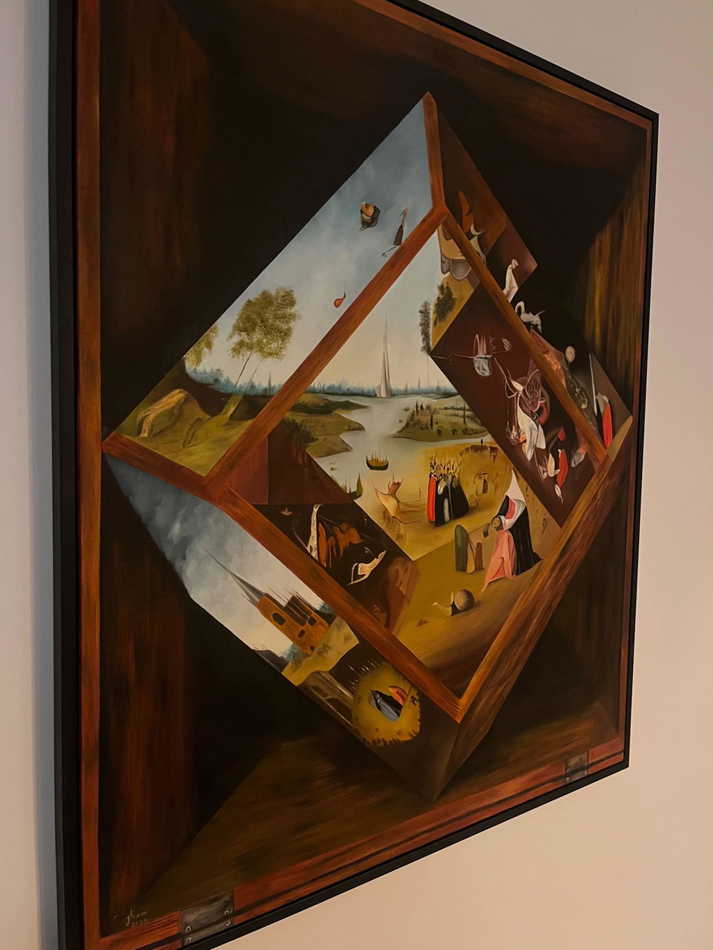
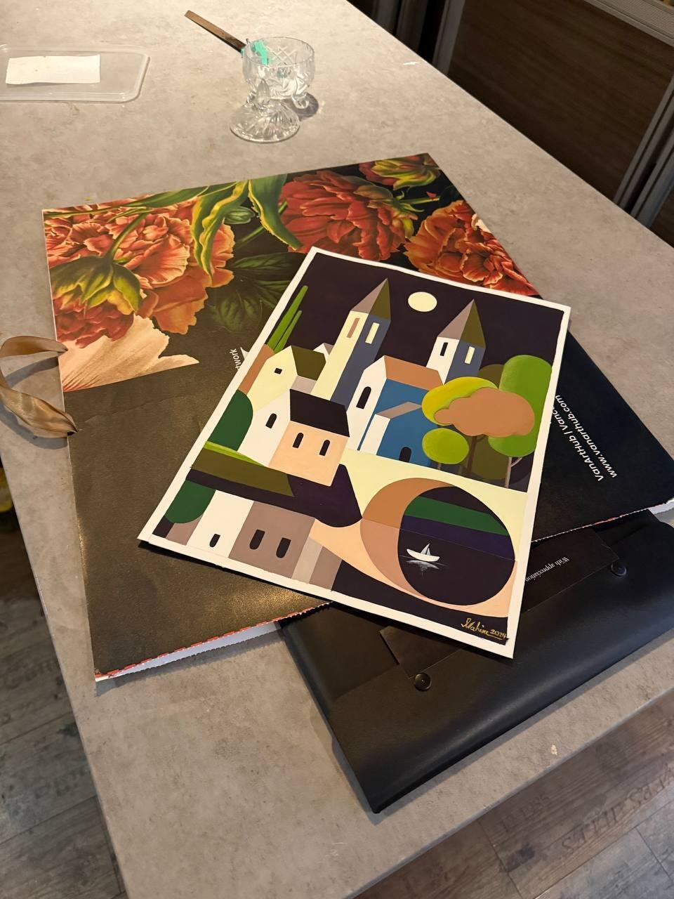
Most framing advice starts with the room. That is backwards. The room changes, the sofa gets replaced, you move house. The painting is the thing that stays, and it should decide.
There is one question that settles more framing decisions than any other: where does the painting want your eye to go? A frame either supports that or works against it.
Abstract
Abstract work usually has no single focal point and no depicted space, so the edge of the canvas is a real boundary rather than a window onto something. That argues for a frame that acts as a boundary too: flat, narrow, unfussy. A floater frame is often the best answer, because it defines the edge without adding a decorative border.
The exception is colour. If the composition runs to the edge in a strong colour, a frame in a neutral tone stops it cleanly. A piece like Beyond the Lightbeam benefits from a quiet frame precisely because the painting is doing all the talking.
Avoid: ornate profiles, gold, and anything with a decorative inner lip. They put a historical border around a contemporary idea.
Landscape
A landscape is a window. It depicts space receding away from you, and the frame is the opening you look through. That is why landscapes take a slightly wider frame than abstracts, and why a scoop profile, which slopes inward, suits them so well: it reinforces the sense of looking into something.
Natural wood is the traditional answer and it earns it. Oak and ash both work, with the choice usually coming down to whether the light in the painting is warm or cool.
Avoid: very narrow metal, which can make a landscape feel cropped rather than framed.
Portrait and figure
A portrait has a subject who is looking out, and the frame is the boundary of their space. Portraits carry more frame than any other subject and often need it: a slim modern profile around a formal portrait can make it look diminished.
How much weight depends on the treatment. A contemporary figure painting like Layers of Her is comfortable in something restrained. A formal, historically-minded portrait wants a cap or cassetta profile with real presence.
Watch: the mat, if there is one. Too narrow a mat around a face crowds it. Portraits want generous borders.
Still life
Still life sits between the two. It has depicted space like a landscape but a contained, closer space, and it tends to have strong internal geometry. A moderate flat or reverse profile usually serves it, wide enough to give it presence, plain enough not to compete with the arrangement inside the picture.
Works on paper, whatever the subject
Once it is on paper the support overrides the subject. Glazing, a mat or spacer, hinged at the top, acid-free backing, whether it is an abstract or a portrait. Then choose the frame's look by subject as above. A graphite portrait and a graphite abstract are built the same way and finished differently.
The summary
| Subject |
Frame weight |
Profile |
Typical answer |
| Abstract |
Light |
Flat or float |
Narrow neutral, or floater on canvas |
| Landscape |
Medium |
Scoop or flat |
Natural wood, moderate width |
| Portrait |
Heavier |
Cap or cassetta |
Wider frame, generous mat if glazed |
| Still life |
Medium |
Flat or reverse |
Plain, moderate width |
These are starting points, not rules. The painting in front of you always beats the category it belongs to, which is why we would rather look at it with you than advise from a list. Bring it to the gallery on Davie Street, or send photographs and the measurements.
A worked example: mixed media and photography
Mixed media and photography do not follow the abstract or landscape rules above cleanly, because both often combine a flat, precise surface with unpredictable physical elements.
Take a mixed-media piece that combines painted canvas with collaged paper and a small amount of raised texture, glued fabric or thicker paint in places. The temptation is to treat it like a painting and pick a frame on colour alone. The better approach is to frame for the most fragile element first: if any part is loose paper or a delicate collage edge, that piece needs a proper rebate depth and, in some cases, glazing to protect the paper component, even though the canvas parts do not need glazing at all. A shadow-box profile with enough depth to clear the raised areas without touching them is usually the right call. See the profile depth guidance for how to size that gap.
Photography behaves differently again. A photographic print is flat, precise, and usually printed on a surface sensitive to fingerprints and UV fading, so it wants glazing almost every time, and a narrow, machined profile in metal or a clean flat wood suits the crispness of the image the way it suits hard-edged abstract painting. Avoid a wide or ornate frame on a photograph: the decorative border fights the documentary, exact quality that makes the image work in the first place. If you are unsure whether your piece counts as a painting or a print for framing purposes, bring it to the gallery on Davie Street, or send photographs and the measurements.
Common questions
What if the painting does not fit any of these categories?
Go back to the question at the top: where does it want your eye to go, and does the frame help or interrupt? That works on anything, including mixed media and photography.
Should a frame ever match a colour in the painting?
Picking up one colour from the work can be effective, but it should be a quiet one, not the loudest. Matching the dominant colour usually flattens the painting, because the frame stops functioning as a boundary and starts reading as more of the same picture.
Does the artist's own preference matter?
Yes, and it is worth asking. Many artists have a clear view about how their work should be presented, and some paint the edges specifically so a piece can hang bare. Where we know an artist's preference, we will tell you.
Should an abstract painting get a plainer frame than a realist one?
Often, yes, though it is not a fixed rule. Abstract work tends to hold attention through colour and composition alone, so a narrow, quiet profile lets it do that without competition. A realist landscape can carry more moulding detail because the eye is already doing representational work and the frame reads as a window rather than a rival.
Does the frame need to match the painting's period?
Not literally, but it helps to acknowledge it. A contemporary painting in a heavily carved antique-style frame can look like a costume rather than a considered choice, unless that contrast is exactly the effect you want. Matching the general weight and formality of the period usually reads better than matching it exactly.
What frame style suits a minimalist painting?
A thin, flat profile in a single quiet colour, usually black, white, or natural wood, works best. Minimalist paintings rely on restraint, and an ornate or wide moulding undoes that immediately. A floater frame is also a strong option if the piece is on canvas, since it adds almost no visual weight.
Can the same painting suit more than one frame style?
Yes, often several. A landscape in warm tones can work in a natural wood moulding, a black floater, or a simple gold profile, each giving the same painting a different mood. There is rarely one correct answer, which is why we recommend trying the actual moulding against the actual piece before committing.
Should I choose the frame or the room first?
Choose the painting's own logic first, then check it against the room. A frame chosen purely to match existing decor can fight the artwork it is meant to be showing off. Once you have a style that suits the piece, there is almost always a finish within that style that also suits the room.