White and off-white mats suit most pictures. A colour works when it comes from the picture itself, and the test is simple: you should see the picture before you see the mat.
A mat is the border of card between a picture and its frame. Its colour changes how a picture looks more than the frame does, because the mat touches the picture on all four sides. The short rule: start with a white or an off-white that matches the paper, and move to a colour only when the picture gives you a reason. This guide explains the rule and the cases where a colour or a dark mat is the better choice.
Why white and off-white are the usual answer
A pale neutral mat reflects light onto the picture and adds no colour of its own, so every colour in the picture looks the way the artist made it. It suits any wall, and it still suits the wall after the room is repainted.
Match the white to the paper
There are many whites: bright white, natural white, cream, ivory. The white of the mat has to agree with the white of the paper.
A bright white mat beside cream paper makes the paper look yellow and old.
A cream mat beside bright white photo paper makes the mat look dirty.
Choose a white that is the same as the paper, or one step deeper. The lightest part of the picture then stays the brightest thing inside the frame. Old prints, maps and documents on toned paper nearly always need an off-white or a cream.
A colour taken from the picture
A coloured mat works when the colour is already in the picture. Three checks keep it from going wrong.
Pick a minor colour. Choose a colour that appears in a small part of the picture. A mat in the main colour of the picture makes the picture and the mat merge.
Pick a paler version. Choose a greyer or paler version of that colour. A mat brighter than anything in the picture is seen before the picture is.
Use less of it. A narrow line of colour often does the work of a full coloured border. See the section on double mats below.
Scarlet Majesty shows how the rule works. It is a coloured pencil drawing on artboard, 30 by 40 cm, of a macaw that is mostly red, with blue and yellow in the wing, so a mat colour could be a pale version of that blue.
A black, charcoal or navy mat makes the light areas of a picture look brighter. It also makes the picture look smaller and the frame look heavier, and it shows dust. A dark mat suits a photograph with dark edges, a picture with strong contrast, or a light subject on a dark ground. It rarely suits a pale watercolour or a pencil drawing, which look faint beside it.
The thin second colour
A double mat is two mats, one under the other. The lower one shows as a thin line around the opening. That line is the place for a strong colour: a dark red or a deep blue from the picture, under a wide off-white mat. The picture gets a clear edge, and the large area stays neutral. Our guide to double mats and fillets shows how wide that line should be.
A deep blue is a colour that suits the thin second mat. Naghsh-e Khial, an oil and gold on paper from our gallery, 30 by 40 cm, shows riders on horses in a crowded scene painted mostly in blue, and a narrow line of that blue could sit under an off-white mat.
The opening of a mat is cut at a slant, called a bevel, and the slant shows the inside of the board. Most boards are white inside, so a thin white line runs around the picture, and on a dark mat that white line is easy to see. Some boards are made black inside, and the line is then black. Look at the cut edge of the sample as well as its face. Our guide to acid-free mats and backing explains what the inside of the board is made of.
The wall and the room
Choose the mat for the picture first and for the room second. Walls get repainted and furniture changes, and the picture stays in its mat. On a white wall, a white mat lets the frame mark the edge of the picture. On a coloured wall, a pale mat separates the picture from the wall colour. Our guide to frame colour by room covers the frame, which is the better part to match to a room.
How to test a colour
Lay the mat samples directly on the picture, covering one corner.
Look in daylight, then in the lamp light the room has in the evening.
Step back to the distance you will stand at in the room.
Ask one question: do I see the picture first, or the mat? If the mat is seen first, try a paler or greyer sample.
Border width changes the result as well, because a wide border shows more of the colour. Our mat border width guide covers width.
A first mat to try, by picture
Picture
First mat to try
Watercolour or drawing on white paper
White or off-white that matches the paper
Old print, map or document on toned paper
Cream or ivory
Black-and-white photograph
White or off-white, or black for a dark, high-contrast print
Colour photograph
Off-white, with a thin line of a minor colour
Certificate or diploma
Off-white or cream, with a thin dark line
Child's drawing
White, or a pale version of one colour in the drawing
If you already own the frame, our workshop page on custom mat cutting explains how a mat is cut to fit it.
Common questions
What colour mat suits most pictures?
A white or off-white mat suits most pictures. A pale neutral mat reflects light onto the picture and adds no colour of its own, so the colours in the picture look as the artist made them. Match the white of the mat to the white of the paper, or go one step deeper, so the picture stays the brightest thing in the frame.
Should a mat be lighter or darker than the picture?
In most cases a mat should be lighter than the picture as a whole and no brighter than its lightest area. A pale mat keeps attention on the picture. A mat darker than the picture makes light areas look brighter and makes the picture look smaller, which suits strong, high-contrast pictures and seldom suits pale watercolours or pencil drawings.
Does a black mat make a picture look smaller?
Yes, a black mat makes a picture look smaller than the same picture looks in a white mat. It also makes the light parts of the picture look brighter and the frame look heavier. A black mat suits a photograph with dark edges or strong contrast. It shows dust, and the white line of its cut edge is easy to see.
What mat colour suits a black-and-white photograph?
White or off-white suits most black-and-white photographs, matched to the white of the photo paper. A print with large dark areas and strong contrast can take a black mat, which makes its light areas look brighter. A mid grey mat tends to make the print look dull, because the grey is close to the middle tones of the print.
Can I use a coloured mat on a watercolour?
You can use a coloured mat on a watercolour when the colour comes from the painting and is paler or greyer than it appears there. Watercolour is thin and light, and a strong mat colour makes it look faint. A safer way is an off-white mat with a thin line of colour around the opening, made with a double mat.
Should the mat match the frame?
The mat and the frame should suit each other, and they need different colours to do their work. The mat gives the picture a plain border, and the frame marks the outer edge. A white mat in a black, white or wooden frame is the common pairing. A mat in the exact colour of the frame makes the two merge into one wide band.
Why does a white mat look yellow next to my print?
A white mat looks yellow next to a print when the paper of the print is a brighter white than the mat. Modern photo paper is often a bright, cool white, and beside it an off-white or cream mat looks yellow or dirty. Choose a mat in the same white as the paper. An old mat can also have yellowed with age.
10% off your custom framing when you show this code at our shop
We frame, stretch canvas and reframe by hand, in our own workshop inside the gallery at
1242 Davie Street. Enter your email and your code appears right here. Show it at the
counter and we take 10% off the job. The code does not expire.
Choosing a selection results in a full page refresh.
Opens in a new window.
In-shop offer · 1242 Davie Street, Vancouver
Get 10% off your framing at our shop
Add your name and email and your code appears on the next screen. Show it at the counter
and we take 10% off any framing, stretching or reframing job you bring us. It does not
expire.
Exceptional Service and a Truly Memorable Art Purchase
I had a wonderful experience with Van Art Hub Gallery. I came across two pieces by Melina Ghaemi — *Mad Mirrors* and *Small World in the Hands of a Stranger* — and immediately fell in love with them.
I contacted Van Art Hub Gallery, and they were incredibly helpful throughout the entire process, from arranging the payment to organizing the shipping. At first, I was a little skeptical and nervous about how everything would work, especially since the paintings were still in Iran and it was shortly after the war. But the gallery handled everything with such professionalism and care that my concerns quickly disappeared. Amazingly, they were able to get the paintings to Canada in just two days!
The pieces are absolutely captivating. Even when I picked them up from the frame maker and was simply carrying them to my car, several people stopped and asked me about the paintings. That says a lot about how striking and special Melina Ghaemi’s work is.
A big thank you to Van Art Hub Gallery for making this experience so smooth and enjoyable. I truly appreciated their professionalism, communication, honesty, and integrity throughout the entire process. I would happily work with them again and highly recommend them to anyone interested in purchasing art through the gallery.
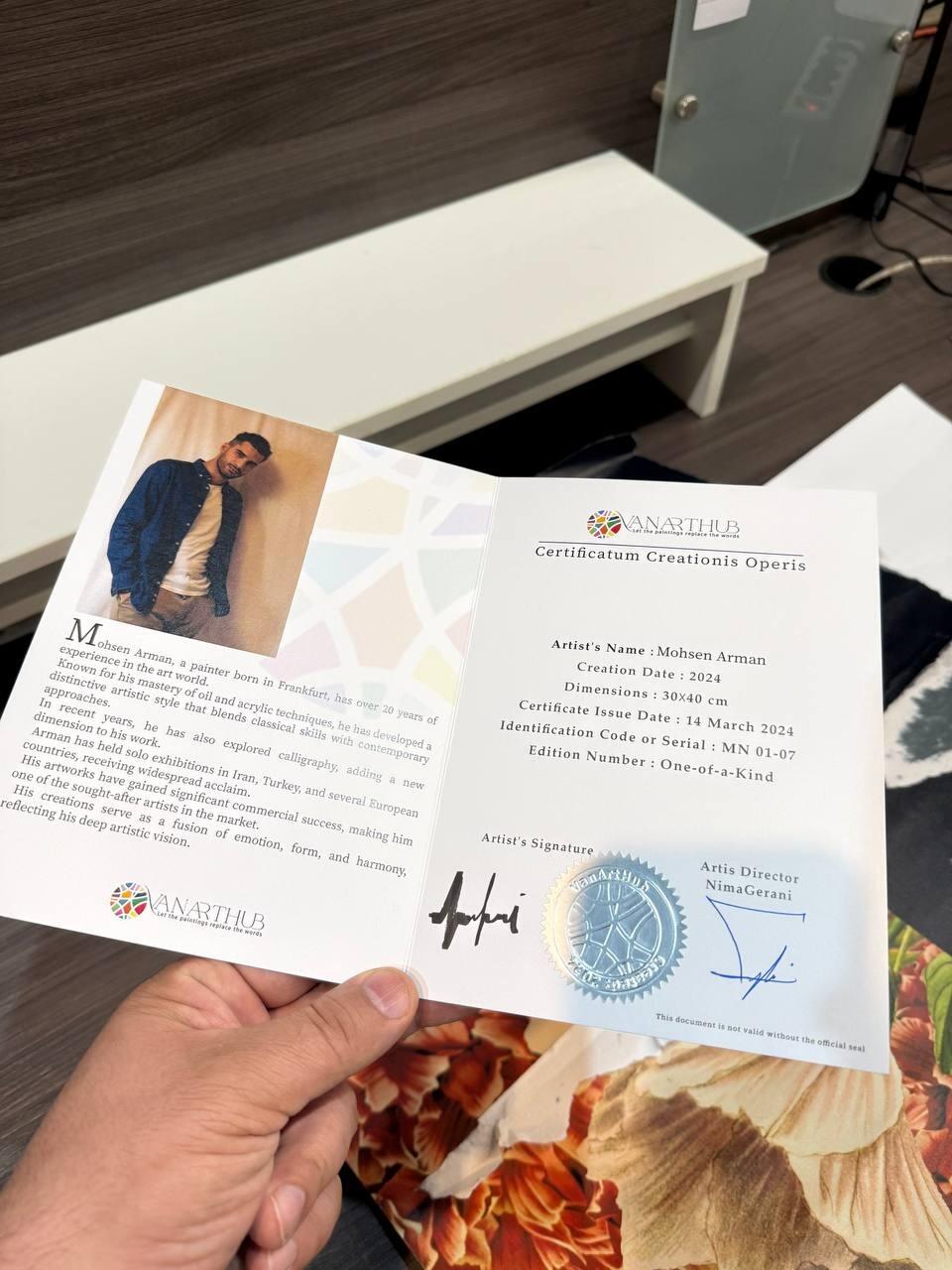
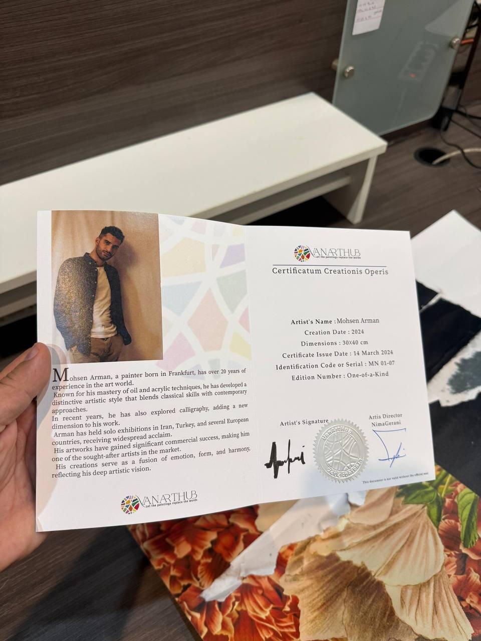
I got my order today and your work is really good. I didn’t expect to get a certificate for this painting, it was a surprise. Thanks for caring about small details.
The support team was really helpful and followed up nicely, wich I really appreciated. The painting is just like the photo – great quality and very detalied. I just wish it arrived a bit sooner, but honestly it was worth the wait.
I received my painting today. The support team was great and very responsive. The artwork is exactly what I was hoping for – even more beautifull in person. Truly a valuable piece. I’ll definetely order again. Thank you!