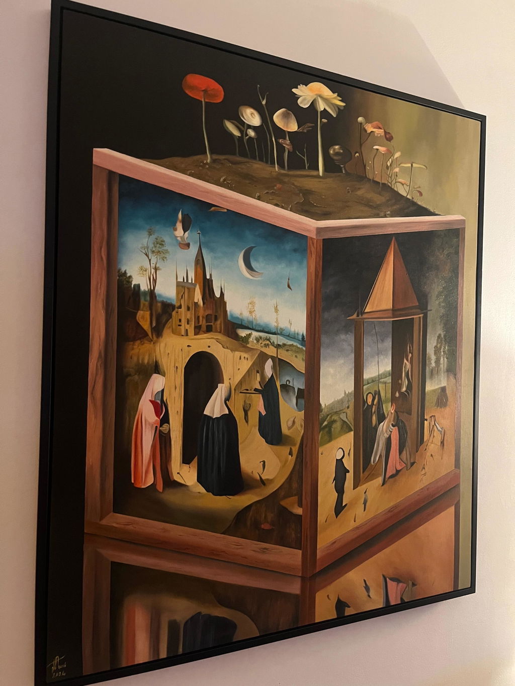
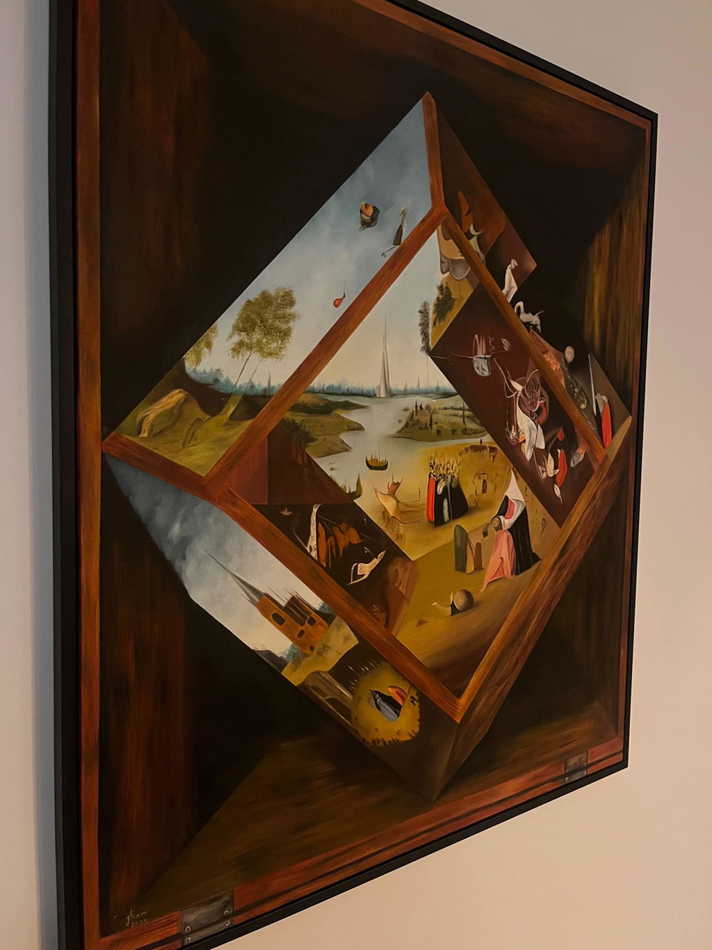
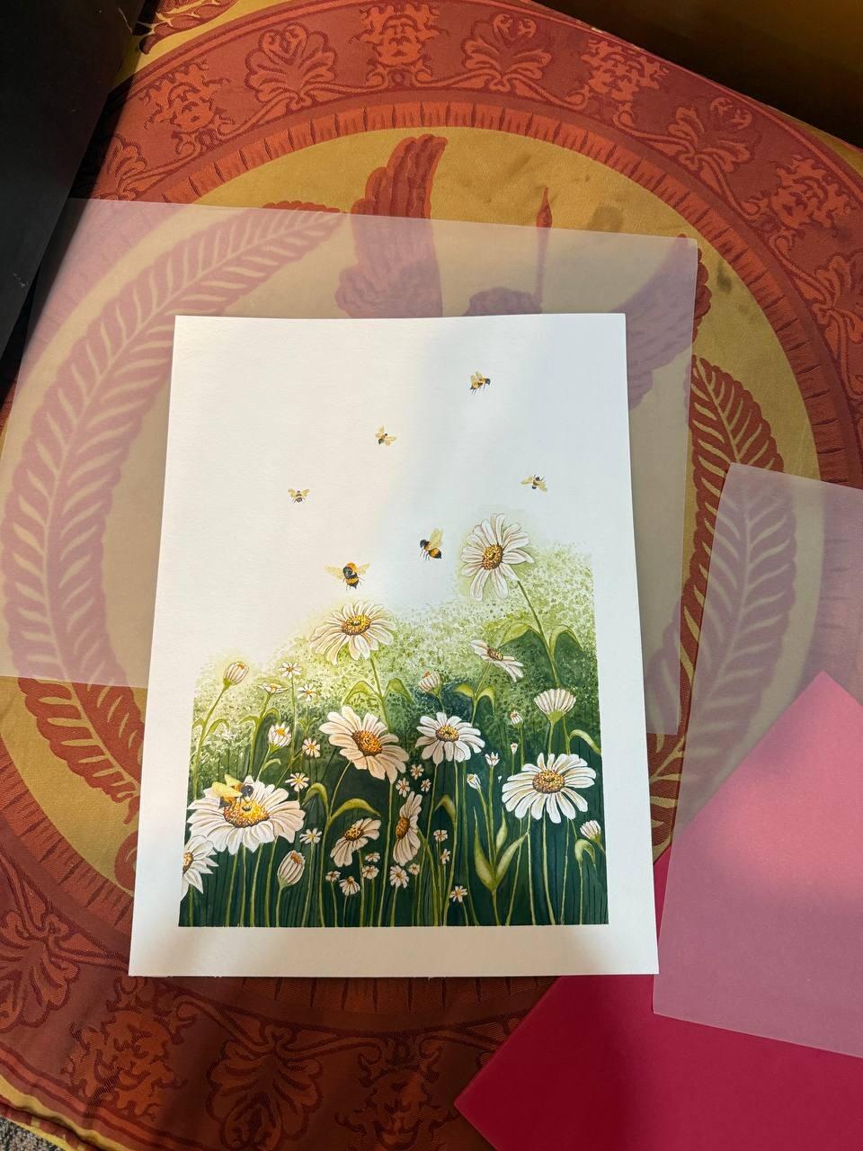
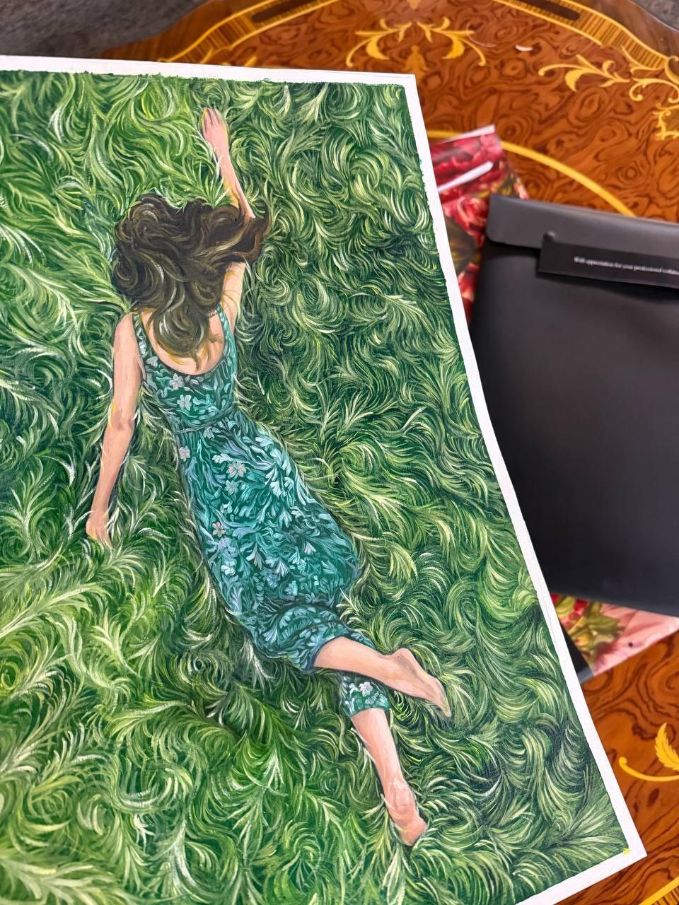
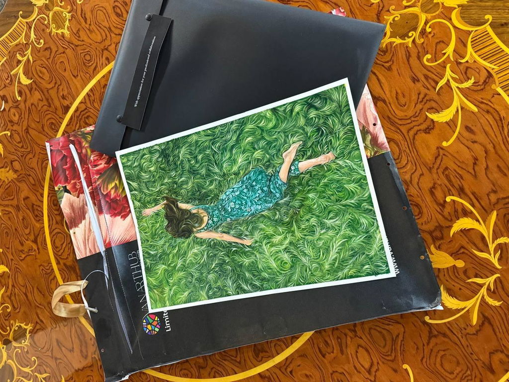
A restaurant sells a meal, but it also sells an hour or two of feeling somewhere nice. The art on the walls is part of that feeling. It sets the mood before the first plate arrives, and it has to keep working under dim light, in warm humid air, and with diners sitting a few feet away.
This guide covers how we help restaurants choose original paintings that suit the room, read well in low light, survive a busy dining service, and match the cuisine and the design. For the bigger picture across a hotel or venue, see our hospitality art hub.
Choose art for the mood of the room
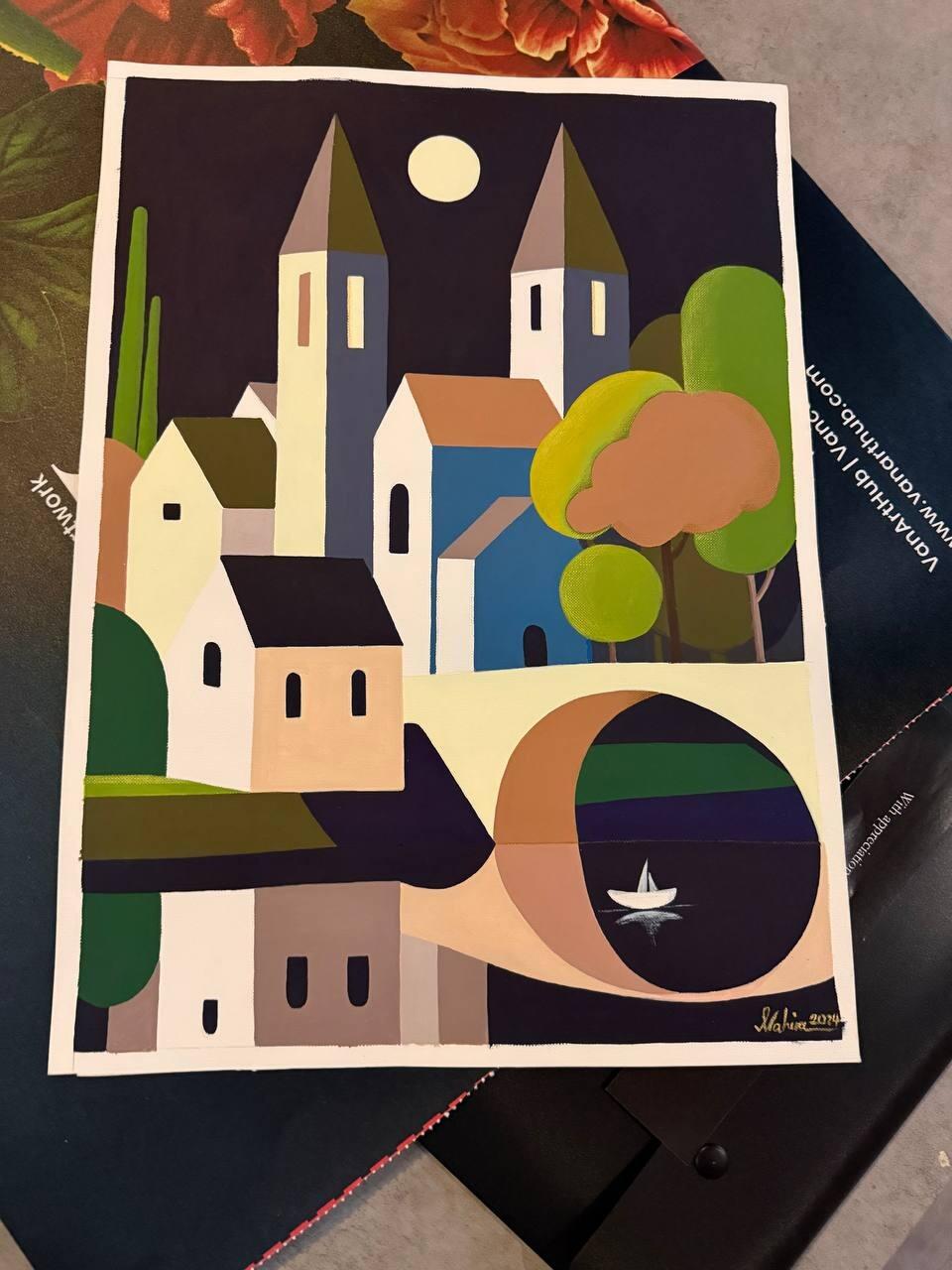
Start with the feeling you want, not the wall. A quiet fine-dining room wants calm, so a soft landscape or a gentle abstract in deep tones fits. A lively casual spot can take bold colour and energy. The art should agree with the pace of the room. Bold paintings in a hushed room feel loud. Muted paintings in a fun room feel flat.
Original work helps set a real mood because texture and depth catch the eye in a way a flat print cannot. Browse our hotel wall art collection for the range of moods, from calm to bold.
Reading well under low light
Most restaurants are dim on purpose, and dim light changes how a painting reads. Dark, busy pieces disappear into a low-lit wall. Lighter tones and clear shapes hold up much better. A few practical rules we use:
- Favour paintings with clear contrast and a bright or mid-tone area, so the eye still finds them in low light.
- Avoid very dark pieces on dark walls unless you can light them directly.
- Add a small warm picture light or an angled spot on key pieces so they stay visible at dinner service.
- Check the art in the evening light you actually use, not under bright daytime cleaning lights.
Holding up near the kitchen and diners
A dining room is a working space. Grease, steam, heat near the pass, and the odd knock from a busy server all wear on art. We plan for that.
Keep the best pieces away from the pass
The wall nearest the kitchen door gets the most heat, steam, and airborne grease. Put hardier pieces there and save the signature work for cooler, cleaner walls in the main dining area.
Frame and glaze for a working room
For walls near the kitchen or in a tight space where diners brush past, we can add glazing that protects the surface and wipes clean. A solid frame protects the edges from knocks. In quieter corners, an unglazed canvas keeps the raw texture that makes an original feel alive.
Matching cuisine and design
The art should sound like the same restaurant as the menu and the room. That does not mean literal. A seafood restaurant does not need paintings of fish. It means the palette and mood should match. Warm earthy tones suit a rustic kitchen. Cool blues and greens suit a coastal or modern room. Bold colour suits a bright, casual concept.
As a Vancouver studio selling original Canadian paintings, we can lean into local landscape and coastal subjects when that fits your story, or stay fully abstract when it suits the design. For a private dining room that carries a stronger statement, our luxury hotel art collection has pieces with more presence. If your restaurant sits inside a hotel, keep it consistent with your hotel lobby art and plan the whole property together with our hospitality art packages.
Frequently asked questions
What kind of art works best in a restaurant?
Choose art that matches the mood and pace of the room. Calm, soft pieces suit fine dining, while bold colour suits lively casual spots. Favour clear contrast and a bright or mid-tone area so the work still reads in low light, and match the palette to your cuisine and design rather than choosing literal food subjects.
How do I make art visible in a dimly lit dining room?
Pick lighter tones and clear shapes that do not vanish on a dark wall, and add a small warm picture light or angled spot on key pieces. Avoid very dark paintings on dark walls unless you can light them directly. Always check the art under the evening light you actually use for service.
Will art survive near the kitchen and busy diners?
Yes, with the right placement and framing. Keep signature pieces away from the kitchen pass, where heat, steam, and grease are worst, and use hardier work there. For walls near the kitchen or tight paths, we add glazing that protects the surface and wipes clean, plus a solid frame to guard the edges.
Should restaurant art match the food we serve?
Match the mood and palette, not the literal subject. A seafood spot does not need paintings of fish. Warm earthy tones suit a rustic kitchen, cool blues and greens suit a coastal or modern room, and bold colour suits a bright casual concept. The art should feel like the same restaurant as the menu.
Want help matching art to your dining room and lighting? Get free advice from our team on the art advisory page and we will suggest pieces that read well in your space.