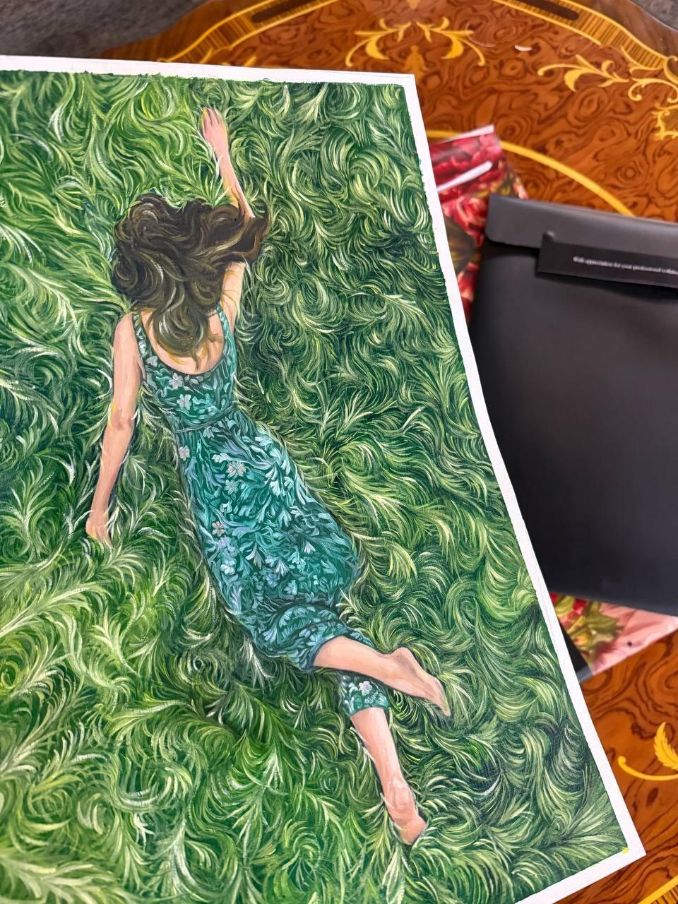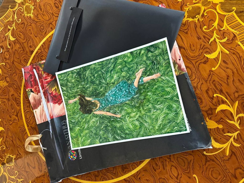
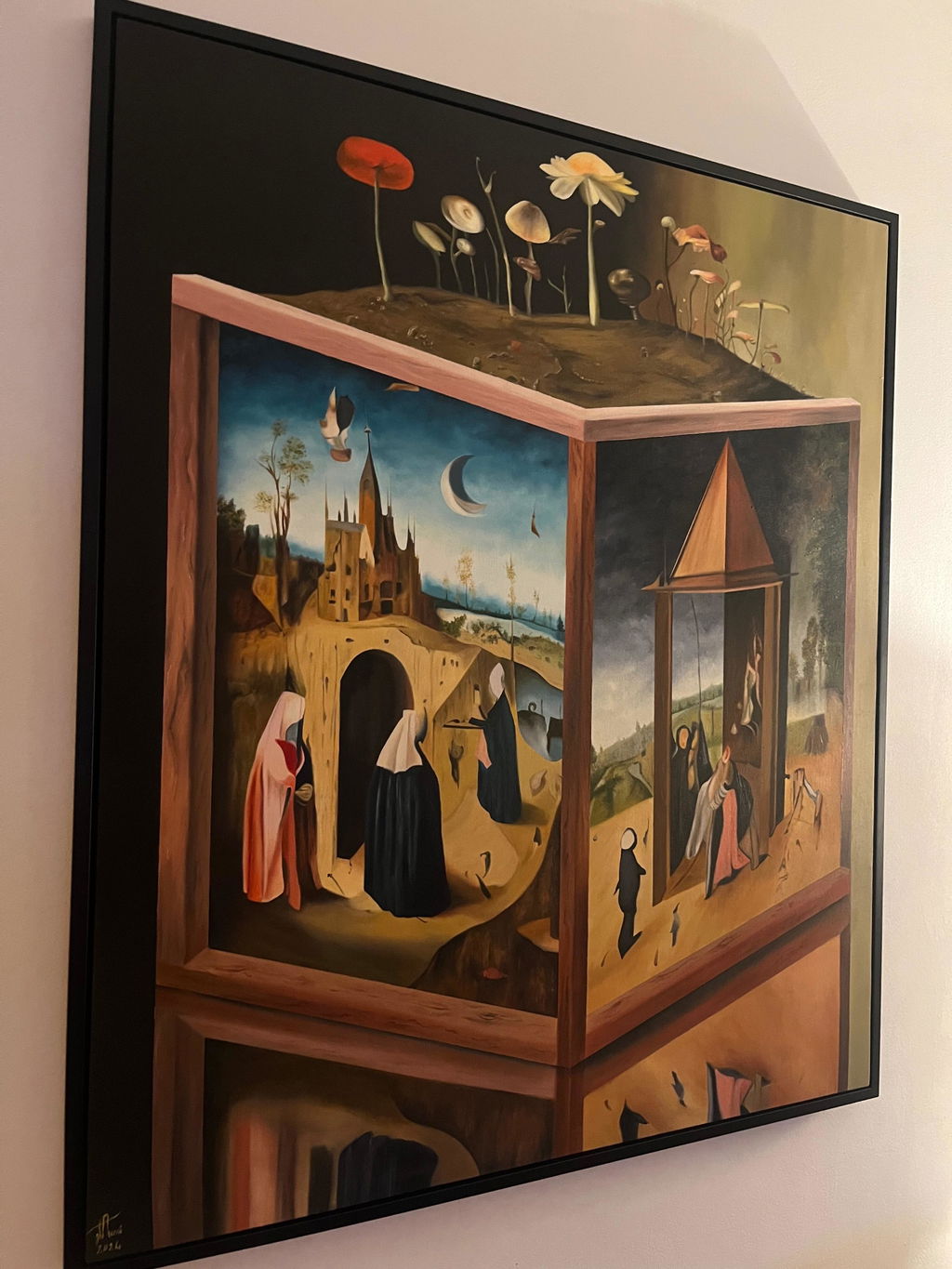
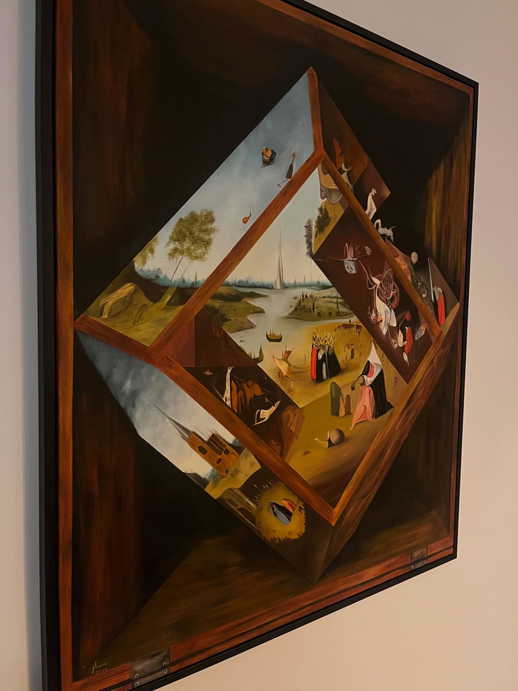
I had a wonderful experience with Van Art Hub Gallery. I came across two pieces by Melina Ghaemi — *Mad Mirrors* and *Small World in the Hands of a Stranger* — and immediately fell in love with them.
I contacted Van Art Hub Gallery, and they were incredibly helpful throughout the entire process, from arranging the payment to organizing the shipping. At first, I was a little skeptical and nervous about how everything would work, especially since the paintings were still in Iran and it was shortly after the war. But the gallery handled everything with such professionalism and care that my concerns quickly disappeared. Amazingly, they were able to get the paintings to Canada in just two days!
The pieces are absolutely captivating. Even when I picked them up from the frame maker and was simply carrying them to my car, several people stopped and asked me about the paintings. That says a lot about how striking and special Melina Ghaemi’s work is.
A big thank you to Van Art Hub Gallery for making this experience so smooth and enjoyable. I truly appreciated their professionalism, communication, honesty, and integrity throughout the entire process. I would happily work with them again and highly recommend them to anyone interested in purchasing art through the gallery.
I got my order today and your work is really good. I didn’t expect to get a certificate for this painting, it was a surprise. Thanks for caring about small details.
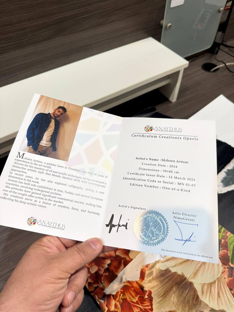
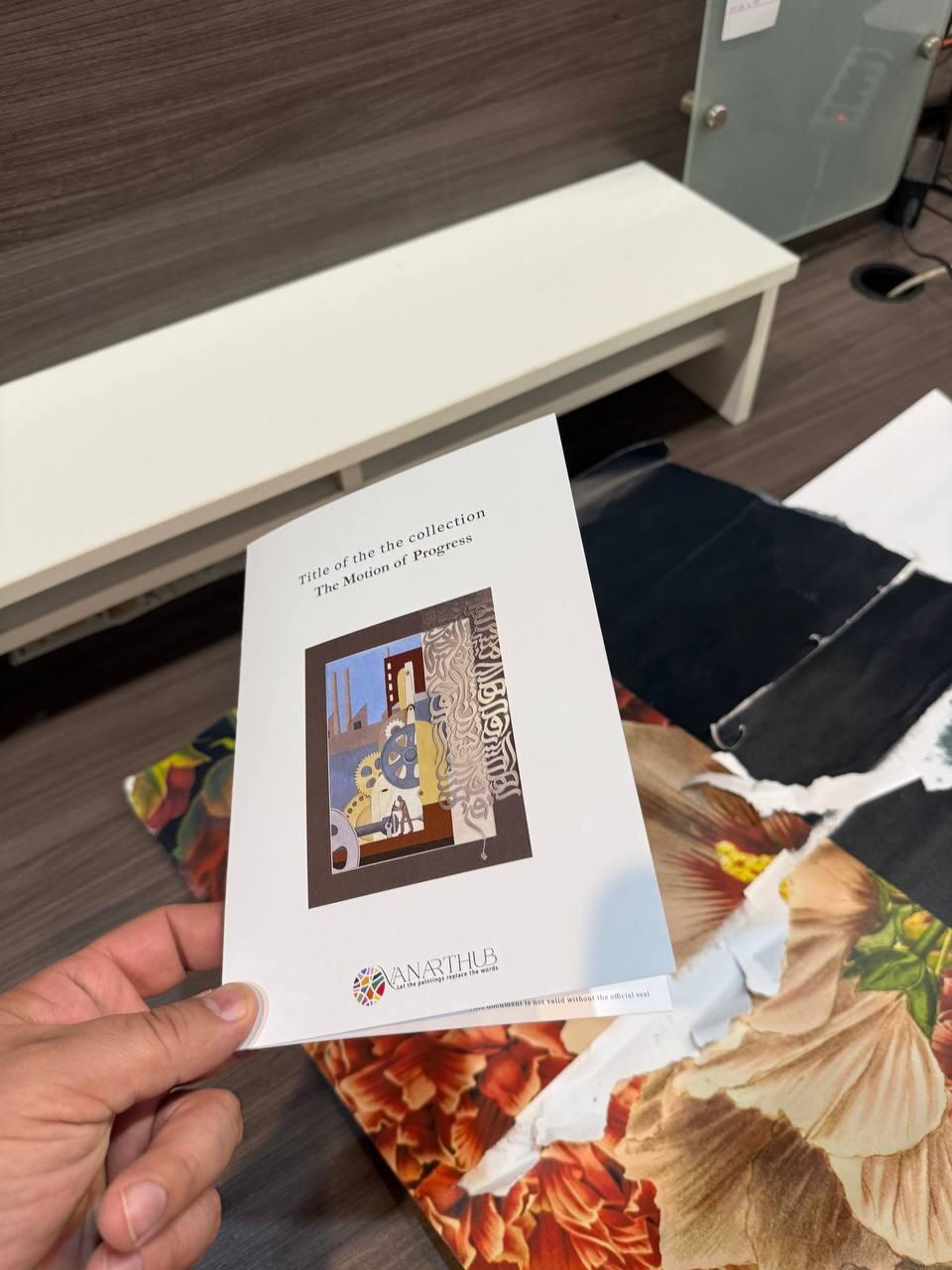
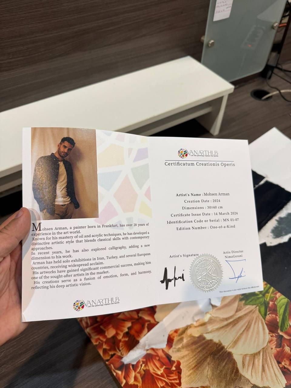
The support team was really helpful and followed up nicely, wich I really appreciated. The painting is just like the photo – great quality and very detalied. I just wish it arrived a bit sooner, but honestly it was worth the wait.
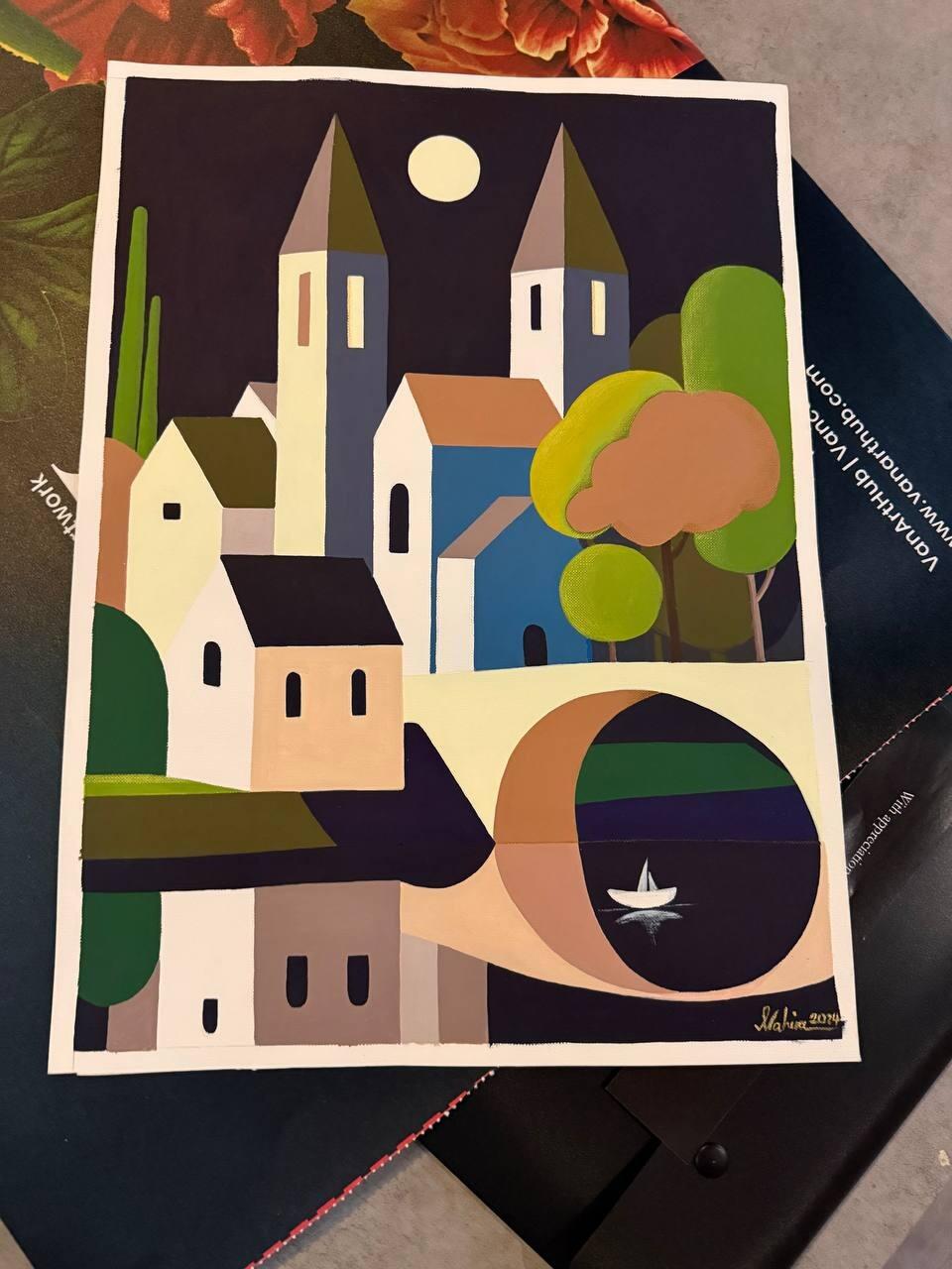
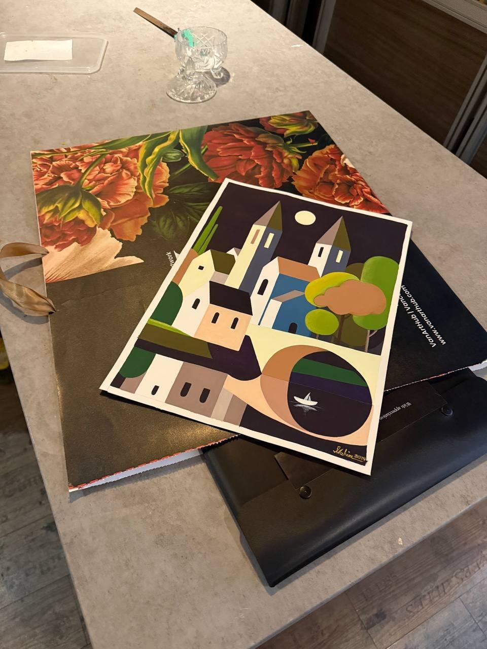
I received my painting today. The support team was great and very responsive. The artwork is exactly what I was hoping for – even more beautifull in person. Truly a valuable piece. I’ll definetely order again. Thank you!
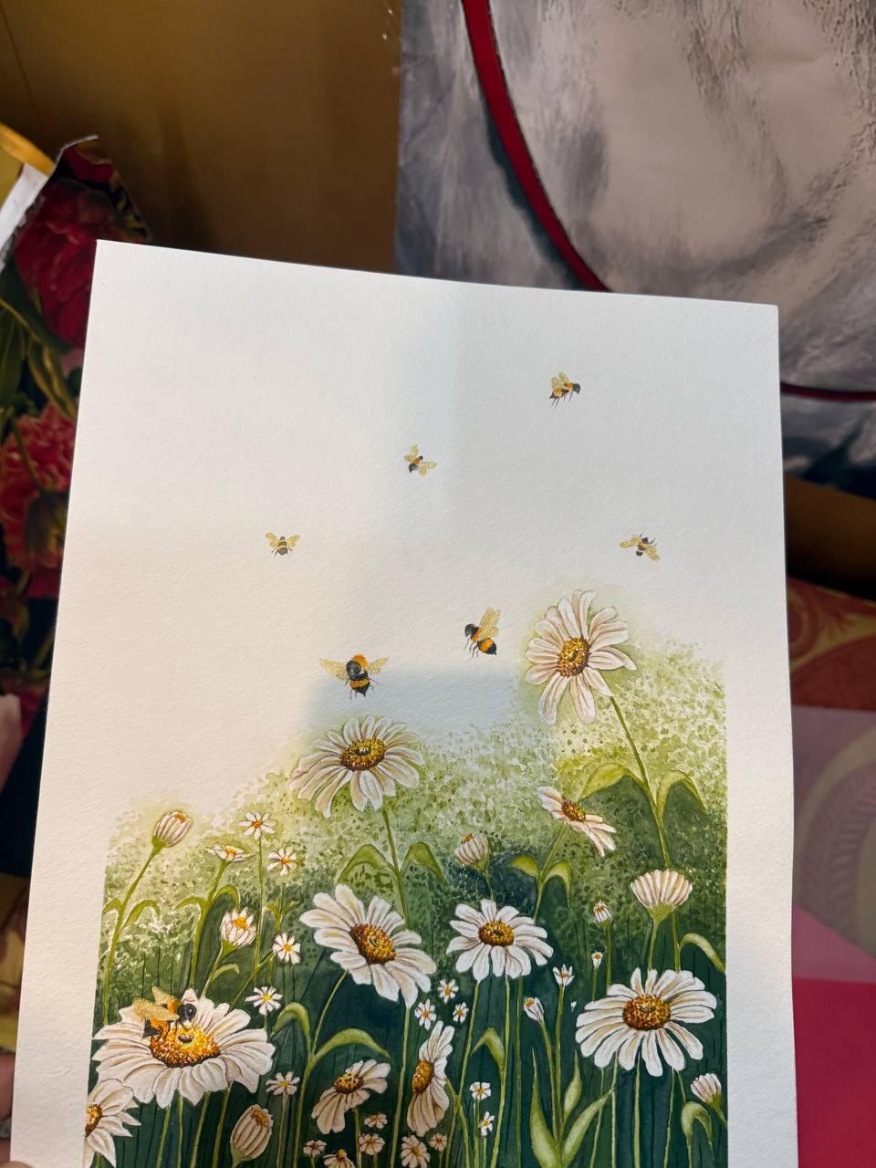
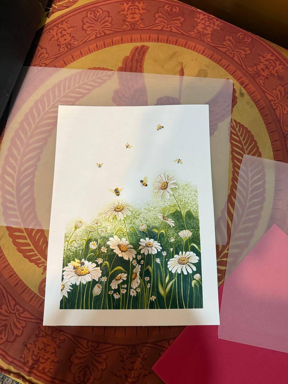
I received the package. Although it arrived a bit late, I was happy to see the piece. It’s well done and carefully made. Thank you.