Choosing Statement Art for an Open-Plan Loft
Updated By VanArtHub Curatorial TeamShare
You found a painting you love, hung it on the long wall of your loft, and stepped back. It looks small. Not wrong, not cheap, just lost. The ceiling is high, the wall runs for twelve feet, and the piece that felt generous in the shop now reads like a postage stamp. This is the most common mistake we watch loft owners make, and it has nothing to do with taste.
Why a loft breaks the normal rules
Most homes give art a natural frame. A sofa below it, a ceiling close above, walls on either side. That frame does half the work of making a piece feel right. A loft removes the frame. You get high ceilings, long open sightlines, and one wall that has to hold a whole living zone instead of one corner. The eye travels further before it lands on anything.
Because of that, the same painting behaves very differently. In a 9-foot bedroom a 24 by 36 piece feels like a real statement. On a loft wall with a 12-foot ceiling and open floor around it, that same painting can look like an afterthought. The room is bigger, so the art has to be bigger to keep up.
Scale: measure the wall, not the couch
In a normal room you size art to the furniture below it. In a loft you size it to the wall and the zone it anchors. Look at the full stretch of wall the eye takes in, then aim for a piece that covers roughly two thirds to three quarters of that visual width. On a 12-foot wall that points you toward something 60 to 100 inches wide, which sounds large until you see it in place.
Height matters too, because loft ceilings pull the eye up. A tall, upright painting or a stacked pair can fill vertical space that a single small landscape leaves empty and awkward. If you are trying to work out the exact inches for your ceiling height and wall, our room-by-room sizing guide gives you real numbers to start from instead of guessing.
One big piece beats a wall of small ones
The instinct in a big space is to fill it. People buy several small paintings and spread them out to cover the wall. In a loft this usually backfires. Across that much open wall, a scatter of little frames reads as busy and unsettled. Your eye does not know where to rest.
One large piece does the opposite. It gives the eye a clear place to land and it tells the room where the living zone begins. If you do want more than one work, keep them as a tight group that behaves like a single large shape, not a spread of separate dots. The goal is one strong focal point per zone, not decoration smeared evenly across the plaster.
Use art to divide the open plan into zones
An open plan has no walls to separate the kitchen from the living area from the workspace. Art can do that job. A bold painting over the sofa says "this is the living room" even with no doorway or divider. A calmer, smaller work near the dining table marks that as its own space. You are using the art the way a normal home uses walls: to tell the eye that one area has ended and another has begun.
This is why the biggest, boldest piece belongs at the main focal wall, the one you see first when you walk in or the one the sofa faces. Lesser zones get quieter work so they do not compete. Before you commit to any of this, it helps to know whether a piece will actually sit right in your space. We wrote a full checklist on the signs a painting will work in your space, and it applies double in an open plan where one wrong choice throws off the whole floor.
Negative space is doing work, not sitting empty
New loft owners often feel that blank wall around a painting is wasted room they should fill. It is the opposite. The empty wall around a large piece is what makes the piece feel deliberate and expensive instead of crammed in. Give a big painting room to breathe on both sides and above, and it reads as a considered choice. Push furniture and other frames right up against it and the same painting looks squeezed.
Think of the negative space as part of the composition. In a loft you have plenty of wall, so you can afford to leave a generous margin. That margin is not laziness. It is the frame the architecture took away.
Viewing distance and bold, simple work
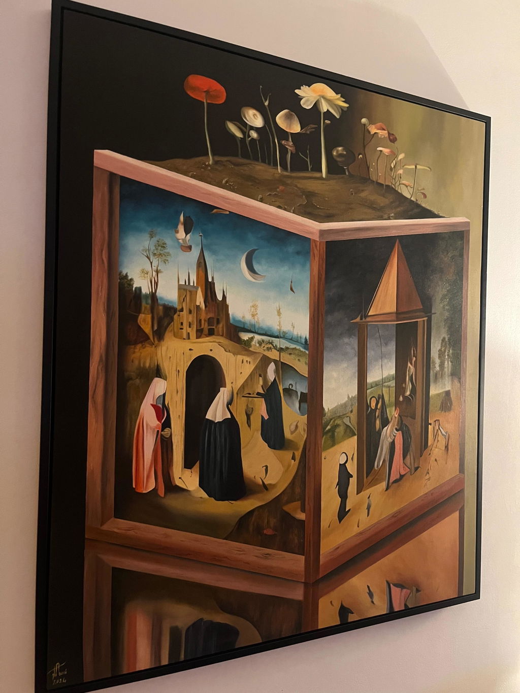
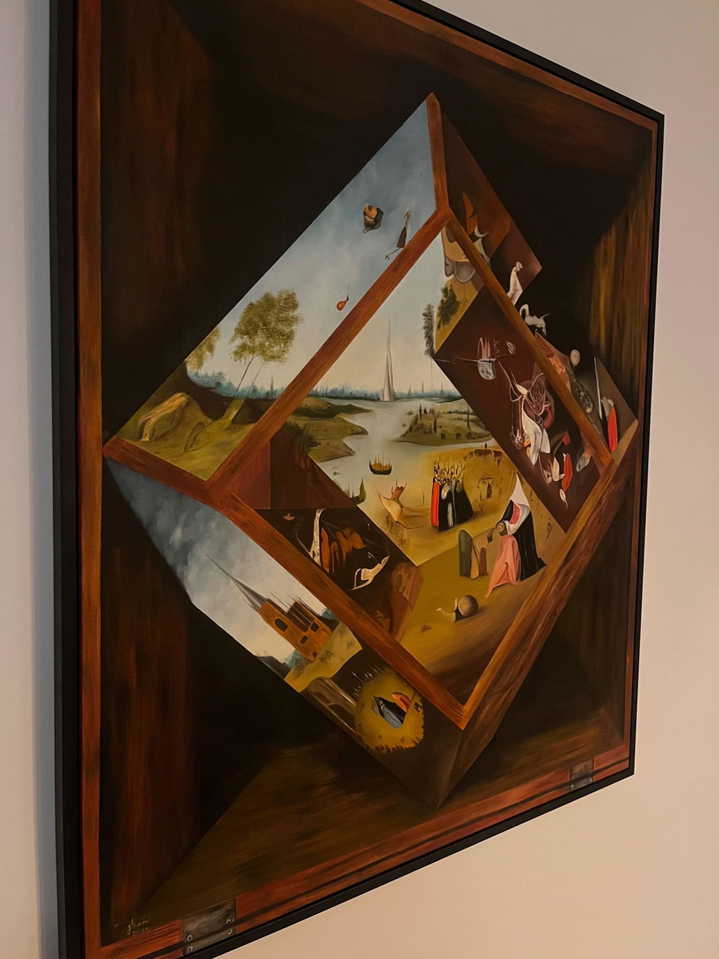
In a loft you often see the main painting from across the room, sometimes from 20 feet or more. That distance changes what reads well. Fine detail and tiny brushwork get lost, so a piece that rewards close study can feel flat from the couch. Bold shapes, strong colour, and clear contrast carry across a big room. A large abstract, a bold landscape, or a high-contrast figure holds up where a delicate, busy piece would fade.
This does not mean loud for the sake of loud. It means the composition should have a clear main event that you can read from a distance. Save the intricate, close-up pieces for a hallway, a reading nook, or a spot where people pass within a few feet.
Dividing a loft with art, in practice
We touched on using art to mark zones. Here is how to actually do it. Think of your loft as a set of rooms with no walls, and let each zone get one clear piece that names it. The living area gets the biggest, boldest work on the wall the sofa faces. The dining zone gets its own piece, quieter and often more upright, that sits over or near the table. A work nook or reading corner gets something smaller and more personal.
The trick is to keep the pieces talking to each other without matching. They do not need the same colours or the same style, but they should feel like they belong to one home. A shared thread, a repeated colour, a similar frame, or all originals in a related mood, is enough to tie the zones together while still letting each one stand on its own. If you want two of them to work as a deliberate pair on one wall, our guide on pairing two paintings that work covers how to make two pieces read as one considered choice rather than two separate buys.
Floor-leaning large canvases in a loft
Not every big piece has to go on the wall. In a loft with tall ceilings and open floor, a large canvas leaned against the wall and resting on the floor is a relaxed, modern look that suits the space. It works especially well behind a console, a low shelf, or at the end of a sightline where a hung piece might feel too formal.
Leaning has real advantages in a loft. You avoid drilling into a concrete or brick wall, which many loft walls are. You can move the piece easily as the room changes. And a very large canvas that would be hard and heavy to hang safely becomes simple to place. The one rule is safety: a big leaning canvas can tip, so anchor it to the wall with a strap or a small bracket, especially if children or pets pass by. Rest it on the floor or a low surface, tilt the top back just slightly against the wall, and let the size do the work. In that much open space, a floor-leaning piece reads as confident, not unfinished.
The short version
A loft asks for bigger, bolder, and fewer. Size the art to the wall and the zone, not to the furniture below it. Let one large piece anchor each area, keep generous empty wall around it, and choose work with strong shapes that read from across the room. Small pieces spread thin will always get lost in that much open space.
Every painting we sell is an original, one of a kind, signed by the artist and shipped with a Certificate of Authenticity. Because scale is so easy to misjudge on a big wall, our 14-day home trial matters here more than usual. You can hang the piece in your actual loft, live with it for two weeks, and return it for a full refund if the scale feels wrong. Shipping is free and fully insured, 3 to 7 business days in Canada and 5 to 10 in the USA, so you can see it in place before you decide.