The Mat Width Rule That Makes a Small Painting Look Expensive
Updated By VanArtHub Curatorial TeamShare
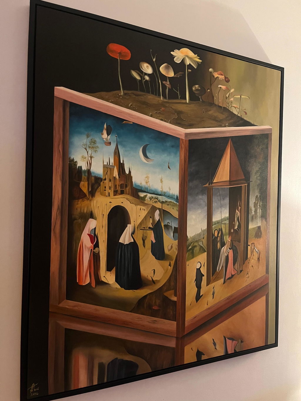
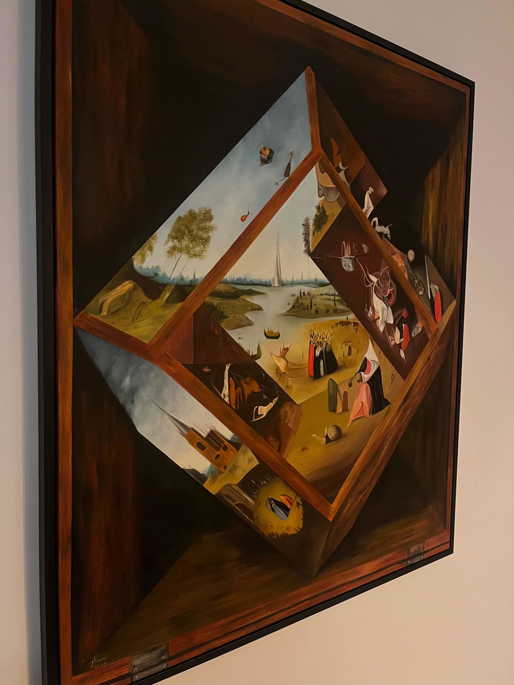
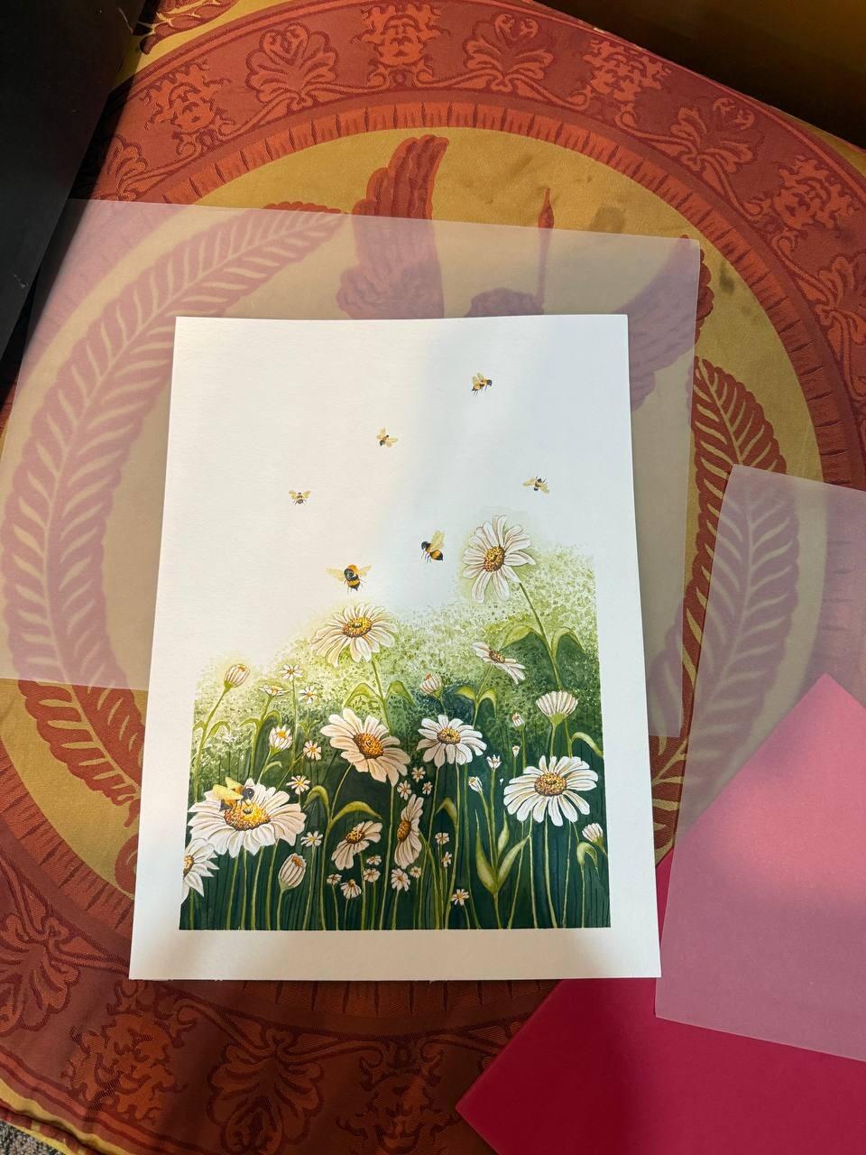
Here is something you can test on your own walls. Find a small framed picture with a narrow border around it. Now imagine the same picture with a border three times as wide.
The second one looks more valuable. Nothing about the artwork changed. What changed is how much empty space it was given.
Wider than feels reasonable
The single most common matting mistake is a border that is too narrow, and it happens because people size the mat in proportion to the artwork. Proportion is exactly the wrong instinct here.
A useful starting point:
- Artwork under 200 mm on its longest side: a border of 50 to 60 mm
- 200 to 400 mm: 60 to 80 mm
- 400 to 600 mm: 80 to 100 mm
- Over 600 mm: 100 mm and up
Notice the border does not scale with the artwork. On a small piece it is enormous relative to the image, and that is precisely right. A 150 by 200 mm drawing in a 25 mm mat looks like a greetings card. The same drawing in a 70 mm mat looks like a work of art.
What the space does is force a pause. It separates the work from the wall and tells the eye that this small thing is the subject, not an incidental object.
The mat should be wider than the frame
If the moulding is 30 mm wide, the border should be more than 30 mm. When the frame is wider than the mat, the eye reads the frame as the dominant element and the artwork gets squeezed between two heavy borders.
This one rule fixes most of the bad framing you see in shops and hotels. It is also why a wide ornate frame needs either a very wide mat or no mat at all, never a thin one.
Weight the bottom border
Cut all four borders equally and the picture will look like it is sliding downwards.
This is not a superstition, it is how vision works. The eye reads the optical centre of a rectangle as slightly above the true geometric centre. So a mat with four equal borders looks bottom-heavy, and the correction is to make the bottom deeper by around 20 percent. On an 80 mm border, that is 80 mm on the top and sides and about 96 mm at the bottom.
Measured, it is uneven. Looked at, it is centred. Every gallery you have ever been in does this and you have never once noticed, which is the point.
Keep the colour boring
White, off-white, or cream, almost always. The mat's job is to separate the artwork from the wall and give the eye somewhere to rest. A coloured mat stops doing that and starts competing.
The real choice is between a cool white and a warm cream, and it should follow the paper rather than the room. Hold the mat against the artwork's own margin: if it makes the paper look yellow, the mat is too cool; if it makes the paper look grey, the mat is too warm.
If you want an accent colour, that is what a thin second reveal or a fillet is for, at 3 to 6 mm rather than across a hundred millimetres of board.
Where it matters most
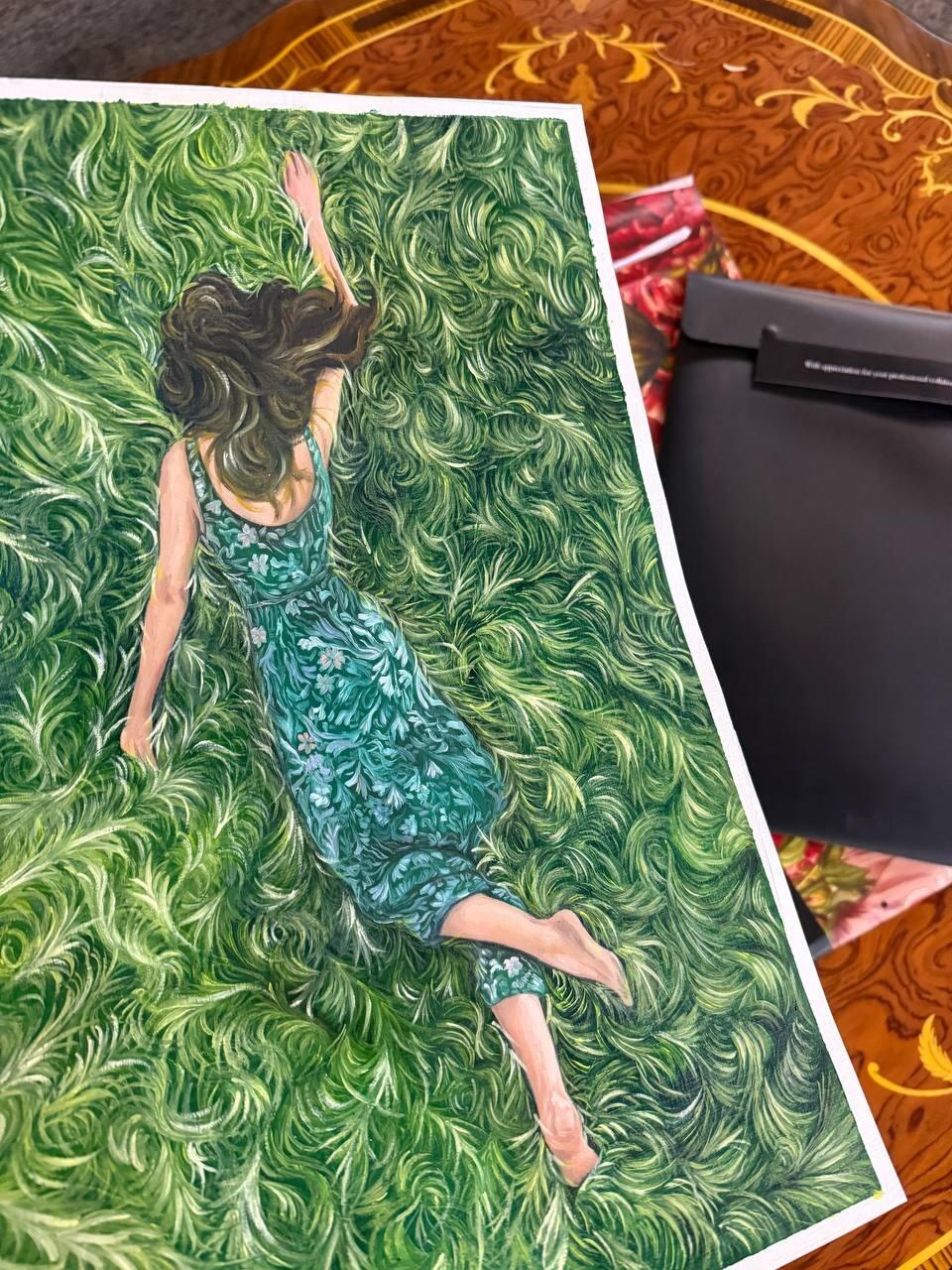
Intimate work. Coloured pencil and graphite pieces reward close looking, and a generous mat is what gives them the room to do that. It is the difference between a drawing that looks like a study and one that looks like a finished work.
Do the arithmetic
Our frame and mat calculator applies all three rules, including the weighted bottom border, and draws the result to scale so you can see the proportions before anything is cut. It is free and nothing is sent anywhere.
More in the mat border width guide, double mats and fillets, and framing small paintings.
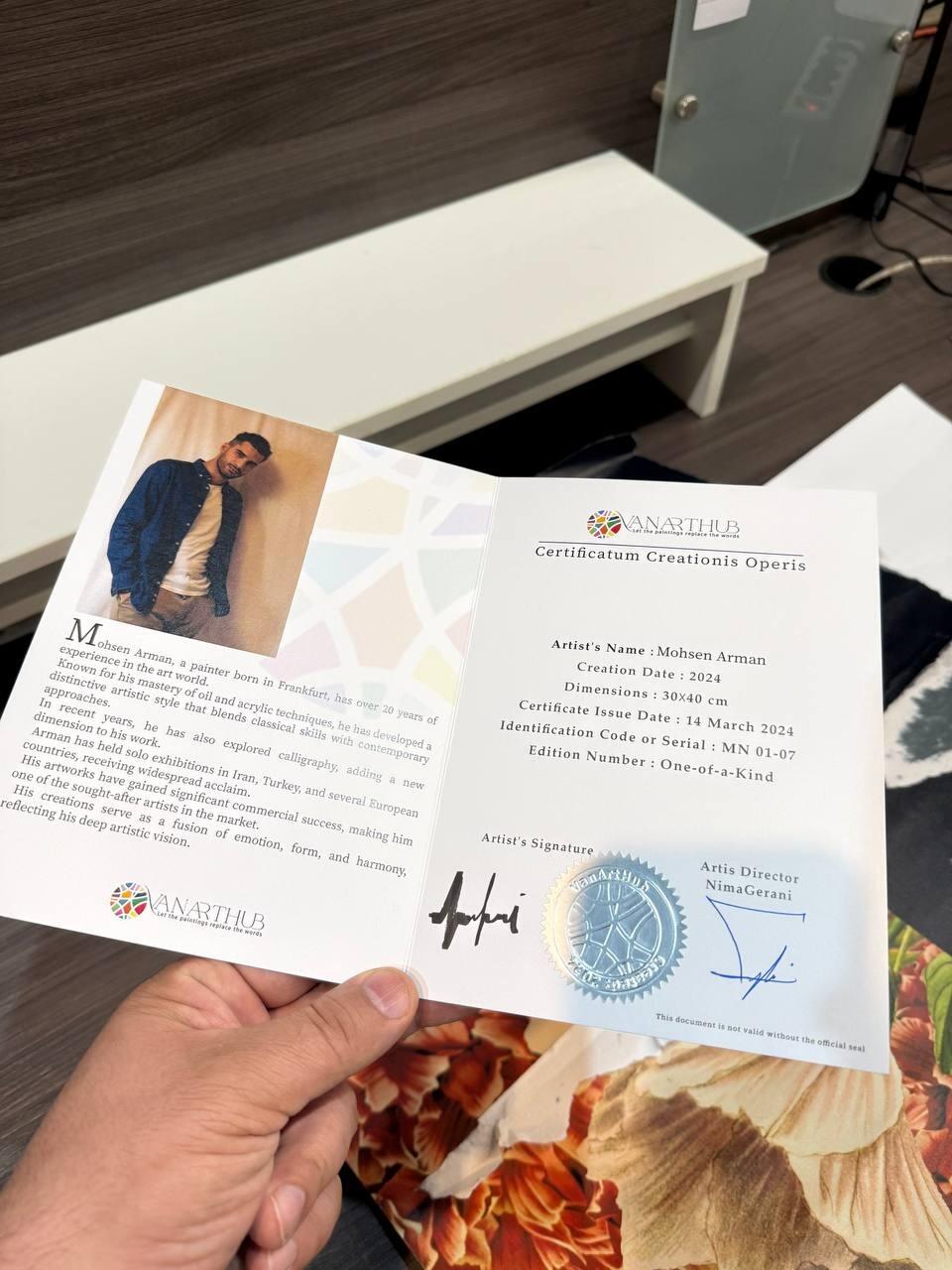
We frame in-house at our Vancouver gallery. Every piece we sell is a signed original with a Certificate of Authenticity, free insured shipping across Canada and the USA, and a 14-day trial. Browse available originals.