Matte vs Gloss Varnish: What It Does to Colour
Updated By VanArtHub Curatorial TeamShare
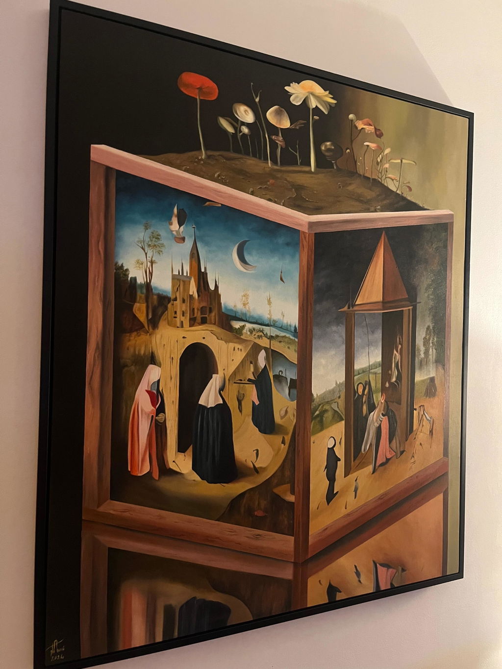
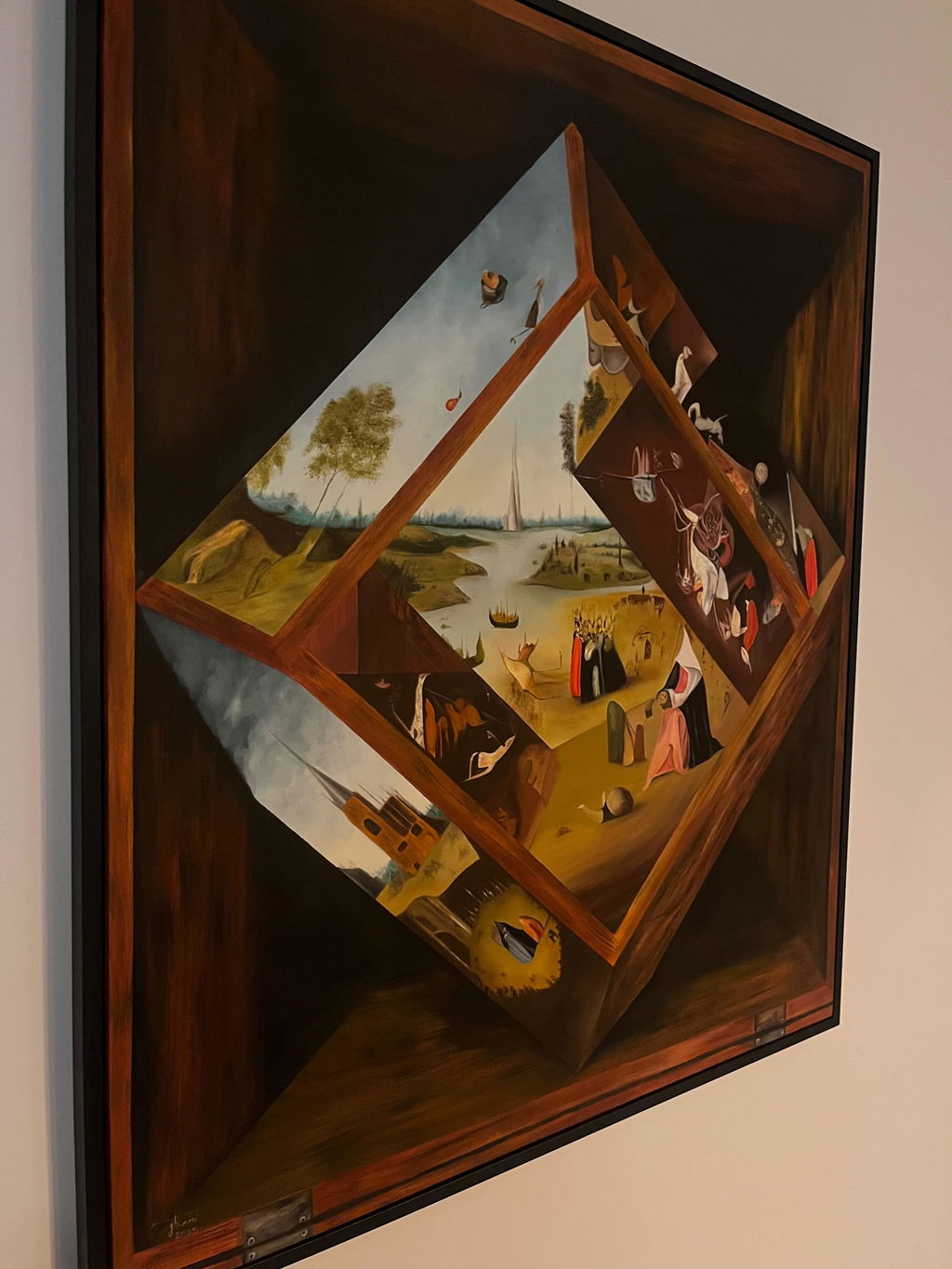
You have found two paintings you like online. The colours look rich and deep in the photo. The piece arrives, you hang it, and in the afternoon light half of it turns into a bright reflection you have to move your head to see past. What changed? Usually nothing about the paint. It is the varnish finish on top.
Varnish is the clear coat an artist brushes or sprays over a finished painting. It protects the surface from dust and light, and it evens out the look of the paint. But it also decides how much light the surface throws back at your eye, and that changes how the colours read. Let us walk through the three finishes you will meet, what each one does, and how to pick.
What varnish actually is, in one minute
When paint dries, some areas dry shiny and some dry dull, depending on the pigment and how thick the paint was laid down. That uneven look is called "sinking in". A dark area can look patchy, with some spots flat and some glossy. Varnish fixes this by covering the whole surface in one even clear layer. From then on, the surface has one consistent look, and that look is set by the finish the artist chose.
Finish is not about the colour of the varnish. A good varnish is clear. It is about the texture of the dried clear coat, which is either smooth (glossy) or slightly rough at a microscopic level (matte). That tiny difference in surface is what scatters or reflects the light.
Gloss: deeper darks, more shine
Gloss varnish dries to a smooth, hard surface. Light hits it and bounces straight back, like light off still water. This does two things.
First, it deepens the dark tones. Blacks look truly black, and shadows gain depth. Colours look wet, saturated, and vivid, close to how they looked when the paint was still fresh on the artist's brush. If a painting relies on strong contrast, a stormy sky, a night scene, deep reds, gloss makes those areas sing.
Second, it reflects the room. Because the surface is smooth, it also mirrors windows, lamps, and bright walls. Stand at the wrong angle and a band of glare crosses the painting and hides part of the image. In a room with a big window or a ceiling light right above the wall, gloss can fight you.
Gloss is a strong choice for a painting with rich dark passages hung on a wall that does not face a window. It is a harder choice in a bright, sunny room where people sit in many spots.
Matte: calm surface, softer darks
Matte varnish dries to a slightly rough surface that scatters light in all directions instead of bouncing it back. The result is almost no glare. You can view the painting from any seat in the room and see the whole image with no bright reflection in the way.
The trade is at the dark end. Because matte scatters light, the deepest blacks lift a little and can read as very dark grey. A painting that depends on a pure, inky black for its punch may lose a small amount of that depth under matte. For soft, quiet work, a foggy coast, a pale abstract, a misty field, this barely matters and the calm surface suits the mood.
Matte is the friend of the bright room. If your wall gets direct sun or sits opposite a window, matte removes the reflection problem that would ruin a glossy piece. The cost is a slightly less dramatic dark range, which many quiet paintings do not need anyway.
Satin: the middle default
Satin sits between the two. It cuts most of the harsh reflection you get from gloss, but keeps more of the depth in the darks than a full matte does. This is why so many artists reach for satin without thinking twice. It is forgiving. It works in most rooms, on most subjects, and rarely looks wrong.
If you are unsure what finish a piece has or what would suit your space, satin is the safe answer. It will not make the darks look grey, and it will not turn into a mirror under a lamp. You lose the extreme of each end, the wettest darks of gloss and the total glare-free calm of matte, but you gain a surface that behaves well almost everywhere.
How to choose for your own room
Start with the light, not the painting. Walk to the wall where the piece will hang and look at it at different times of day. Does direct sun hit it? Is there a lamp or ceiling light close above it? Do people sit off to the side, at an angle to the wall?
If the wall is bright or the seats are spread around the room, lean matte or satin. Glare is the fastest way to make a good painting look worse than it is, and no colour depth is worth a reflection that hides half the image.
If the wall is calm and shaded, and the painting has strong darks or high contrast, gloss or satin will reward you with depth you cannot get any other way. A deep night scene under gloss on a shaded wall looks lit from within.
Then think about the painting itself. Loud, contrast-heavy work tends to want more shine. Soft, low-contrast, atmospheric work tends to want less. When the two signals disagree, the room's light should win, because you cannot change where the window is but you can live with slightly softer darks.
A note on the surface and the paint underneath
Finish sits on top of the paint, so it is separate from what the paint itself is. An oil painting and an acrylic painting can both wear any of the three finishes. If you are still deciding between mediums, our guide to oil versus acrylic versus mixed media explains how the paint underneath behaves, which is a different question from the varnish on top.
One more thing worth saying plainly. A photograph or a print of a painting has a fixed surface set by the printer and cannot be changed the way a real varnished painting can. This is one of the quiet differences between an original and a copy. If you want to understand where those lines sit, see original versus print versus reproduction versus giclee. On a real original, the finish is a choice the artist made with a brush, part of the object you own.
The short version
Gloss deepens darks and makes colour vivid, but reflects the room. Matte removes glare and reads well from any seat, but can soften the deepest blacks toward grey. Satin sits in the middle and suits most rooms, which is why it is the common default. Choose by your wall's light first: bright wall means matte or satin, calm shaded wall with strong darks means gloss or satin. Every original we ship is a real varnished painting, not a print, and it arrives with a Certificate of Authenticity and a 14-day trial, so you can hang it, watch how the finish reads in your own light across a few days, and return it for a full refund with free return shipping if it is not right.