Why a Painting Looks Different Online Than On Your Wall
Updated By VanArtHub Curatorial TeamShare
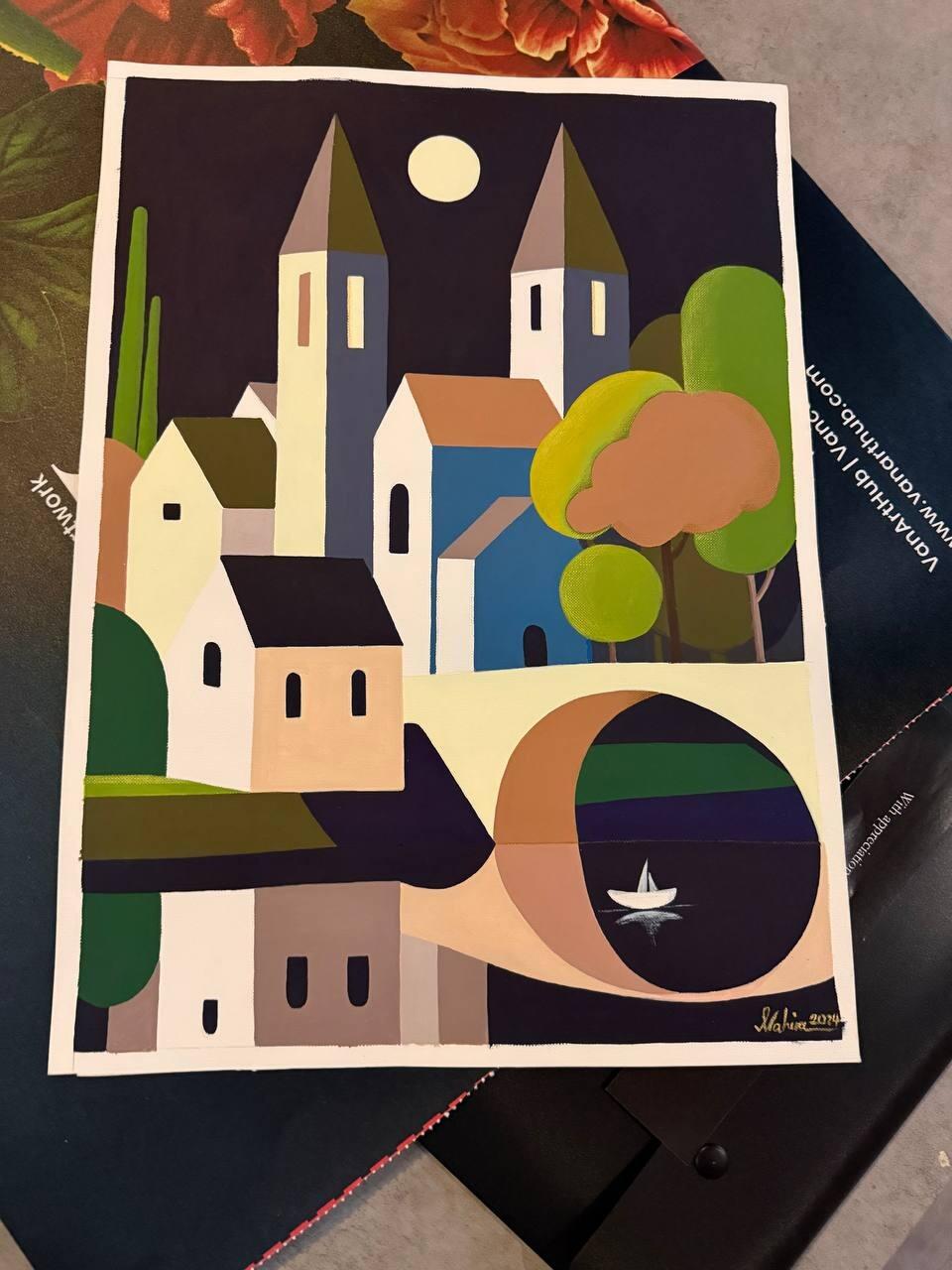
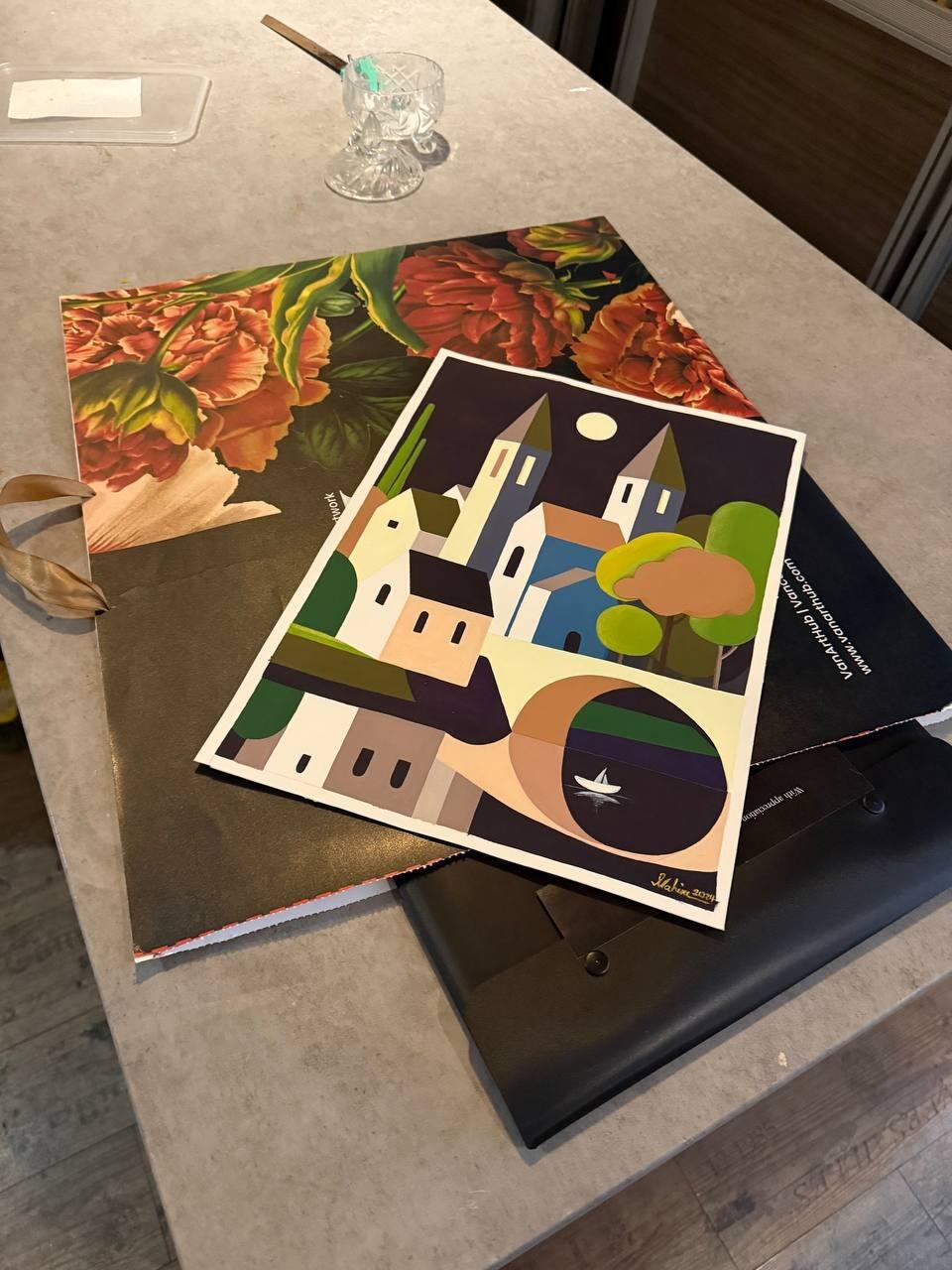
You unwrap the painting, hang it, step back, and something has shifted. The blue is deeper than it looked. The whole thing is quieter. It is bigger than your head said it would be. Nobody misled you and your screen was not broken. A photograph of a painting and a painting on a wall are two different physical events, and once you know where the gaps are you can predict them before you buy.
Your screen makes light. A painting only borrows it
This is the difference underneath every other difference on this page. A screen is a light source. Each pixel emits light straight at your eye, at a brightness the device chose, and holds it whether it is noon or midnight. Colour on a screen is light being made.
A painting emits nothing. It sits in a room and reflects whatever light is falling on it, minus everything the pigments absorb. Colour on a wall is light being subtracted. So the picture on your phone is always working with a purer, more forceful version of the same colour than the object ever has access to.
This is why strong blues, deep reds, and anything approaching a neon shade almost always look more intense on screen. The screen can push those colours to a level that reflected light in a living room simply cannot reach. Nobody is exaggerating the photograph. The medium is doing it.
The reverse is also true and it is the pleasant surprise. Blacks, deep browns, and subtle grey transitions usually look better in person, because a screen flattens the low end and a real paint surface holds detail there that no photograph carries.
Every photograph of a painting is already a translation
Before an image reaches you it has passed through several decisions, and each one moves the result.
The camera sets a white balance, guessing what colour the light in the room was, and every colour in the frame shifts with that guess. It sets an exposure, which decides whether the painting reads bright or moody. The file is then saved in a colour space, and if your device interprets that space differently you get another shift. Then the website compresses the file to load quickly, and compression is hardest on exactly the smooth gradual transitions painters care about most.
None of this is dishonesty. It is the cost of turning a physical object into a few hundred kilobytes. Then it lands on your device, which has its own opinion. Two phones side by side show the same file differently: one runs warm, one runs cool, one boosts saturation. Night mode shifts everything yellow.
If you want the fairest look at a painting online, view it on the largest screen you own, in a normally lit room, with night mode off and the brightness at a middle setting. It costs nothing and it removes most of the distortion.
Texture and gloss cannot survive the trip
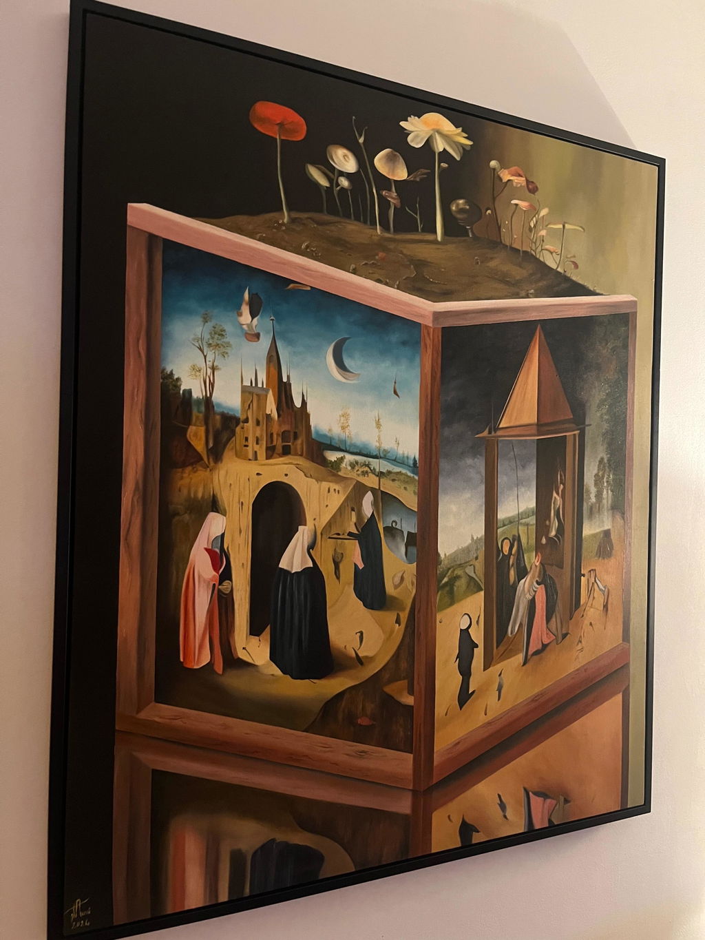
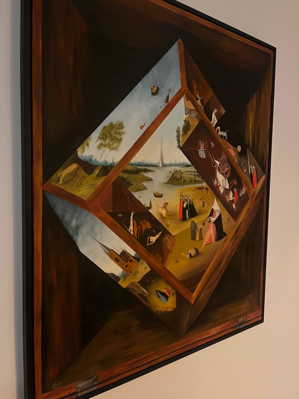
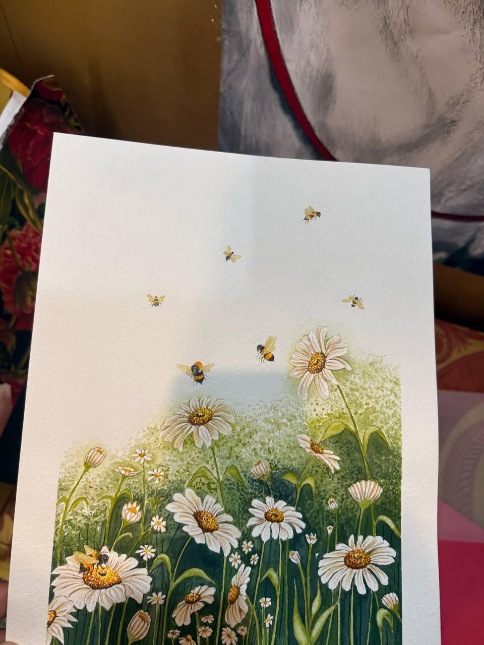
Photographs are flat, and the part that vanishes is often the part people fall in love with in person. Impasto, meaning paint applied thickly enough to stand off the surface, casts tiny shadows that change as you walk past. A photograph freezes one lighting angle, so those ridges become a slightly darker smear.
Gloss is the other casualty. Oil paint and varnish are reflective, and the amount of shine varies across a single canvas depending on how much oil is in each passage. A photograph either kills that with flat lighting or turns it into a distracting hotspot. In a room, gloss is what makes an oil painting look alive as you move.
Our honest position: this is the single biggest reason a painting exceeds expectations on arrival, and it is also the reason we cannot fully show you what you are buying. We photograph every piece as carefully as we can and the surface is still something you have to stand in front of.
Scale is the mistake that costs people money
Colour differences are usually small and pleasant. Size mistakes are neither. On a website every painting is roughly the same size, because they all sit in the same box on the page. Your brain has no anchor, so it assumes a comfortable middle size, which is why nearly every size complaint runs one way: smaller than expected.
Do this before you buy. Take the dimensions from the listing, cut a piece of paper or cardboard to that exact size, and tape it on the wall where the painting would hang. Leave it there for a day and walk past it. It takes five minutes and it is the most useful thing in this article.
Here is our opinion, stated plainly. When a buyer is choosing between two sizes of a work they love, we would choose the larger one nearly every time. Undersized art on a big wall is the most common mistake in home collecting, and nobody has ever told us their painting was too big.
What changes once it is on your actual wall
The photograph was taken under even, neutral light. Your room is not. North-facing rooms in Vancouver give cool, blue-grey light that mutes warm colours. A west-facing room gives warm light that makes reds glow. Warm bulbs push everything amber after dark, so the painting has a day version and a night version.
Wall colour changes it again. A painting on a white wall reads brighter and more graphic. The same work on a deep charcoal wall reads richer and heavier. Coloured light bouncing off a strong wall colour lands on the painting and tints it.
Distance matters too. Online you view a painting filling your screen, which is close-up viewing. On a wall you mostly see it from across the room, where fine detail disappears and the large shapes take over.
A short table of what shifts, and which way
| Element | On screen | On the wall | What to do about it |
|---|---|---|---|
| Bright saturated colour | More intense, emitted light | Calmer, reflected light | Expect a softer version. Usually a relief |
| Blacks and deep tones | Flattened, detail lost | Richer, more visible variation | Expect an improvement |
| Texture and impasto | Mostly invisible | Shifts as you walk past | Ask for a raking light photo of the surface |
| Gloss and varnish | Removed or a hotspot | Changes with your position | Ask which passages are matte and which are glossy |
| Size | All works look similar | The real difference is large | Tape the exact dimensions on your wall first |
| Edges of a canvas | Rarely shown | Visible from the side every day | Ask whether edges are painted or raw |
That last row catches people out. On a gallery-wrapped canvas hung without a frame, the sides are part of the object, and whether the artist continued the image around them, painted them a flat colour, or left the raw canvas showing changes how the work sits on the wall.
What to ask us, and why we send a painting home with you anyway
You are allowed to ask for more than the listing photographs. Ask for a photo with the light raking across the surface. Ask for a shot of the sides. Ask what it looks like in daylight compared to lamplight, because we see these works in both. We would rather spend twenty minutes answering than send a piece that comes back.
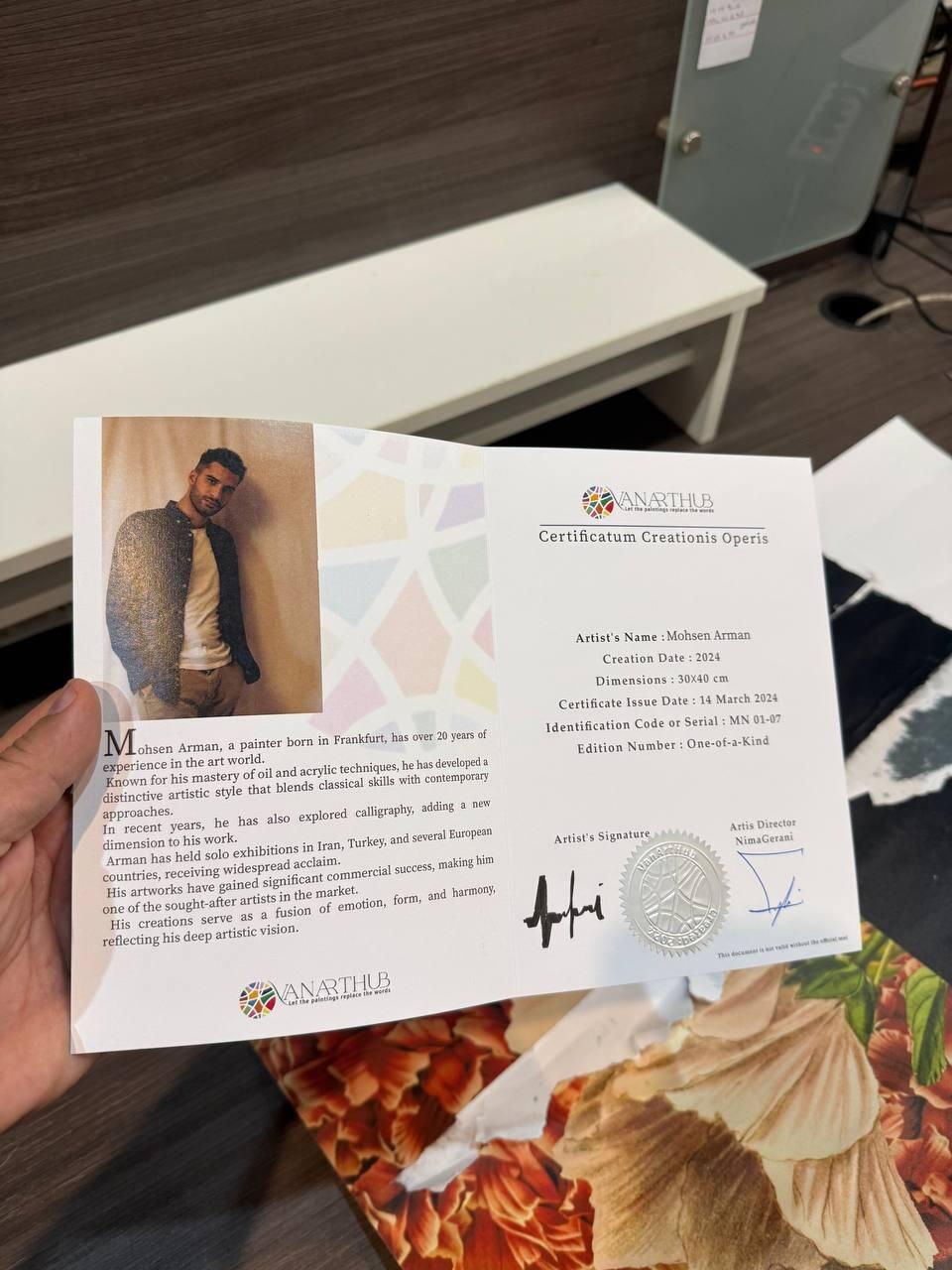
And this is why the 14-day trial exists. No photograph, no video, and no description settles the question of whether a painting works in your room. Only your room settles that. Hang it, live with it, look at it in the morning and again at night. If it is not right, tell us within 14 days and we send a prepaid insured label and refund you in full. We pay the return shipping.
The honest limit is on our side. We cannot photograph our way out of this problem, and any gallery claiming their images are a perfect match for the object is overpromising. The trial is the answer to a real limitation, which is why we would rather have it than a longer product description.
Key Takeaways
- A screen makes light and a painting reflects it. That is why strong colours look more intense on a phone.
- Blacks, deep browns, and subtle grey transitions almost always look better in person than in a photograph.
- Texture and gloss cannot be photographed properly. They are the usual reason a painting beats expectations.
- Every painting looks the same size in a web listing. Tape the real dimensions on your wall before you buy.
- When choosing between two sizes of a work you love, take the larger one. Undersized art is the common mistake.
- Ask for a raking light photo and a shot of the canvas edges. Sellers who care will send both.
Frequently Asked Questions
Why does the painting I received look different from the website photo?
Because a screen emits light and a painting reflects it. Your device can produce colours at an intensity that reflected light in a room cannot match, so strong colours usually arrive calmer. Camera white balance, file compression, and your room's own lighting all shift the result further.
Which usually looks better, the photo or the real painting?
The real painting, for most work. Texture, gloss, and the depth in dark passages do not survive photography, and those are exactly what people respond to in person. The main exception is very bright saturated colour, which a screen can push beyond what any pigment reflects.
How do I judge the size of a painting from a website?
Take the listed dimensions, cut paper or cardboard to that exact size, and tape it on your wall where the work would hang. Leave it up for a day. Every painting looks the same size in a web listing, so this is the only reliable way to feel the real scale before it arrives.
Should I choose the bigger or smaller painting when I cannot decide?
The bigger one, in our experience. Undersized art on a large wall is the most common mistake we see, and buyers regret it far more often than the reverse. Leave breathing room around the work, and remember you will see it from across the room far more than from close up.
Why can I not see the texture of the paint in the photos?
A photograph is flat and freezes one lighting angle, so raised paint becomes a slightly darker smear instead of something that shifts as you move. Ask the seller for a photo taken with the light skimming across the surface at a low angle. That reveals the texture clearly.
Will the painting look different in my room than in the gallery?
Yes. A north-facing room gives cool light that mutes warm colours, and a west-facing room gives warm light that makes reds glow. Warm bulbs push everything amber at night, so the work has a day version and a night version. Wall colour shifts it again.
What should I ask before buying a painting online?
Ask for a raking light photograph showing surface texture, a shot of the canvas edges, whether the sides are painted or raw, how the work reads in daylight compared to lamplight, and the exact dimensions. Any seller who cares about the piece will answer all of these.
How long do I have to return a painting?
Fourteen days from delivery. Hang it, live with it, see it in morning and evening light. If it is not right, tell us within those 14 days and we send a prepaid insured return label and refund you in full once it is back. We pay the return shipping.
Are these prints or original paintings?
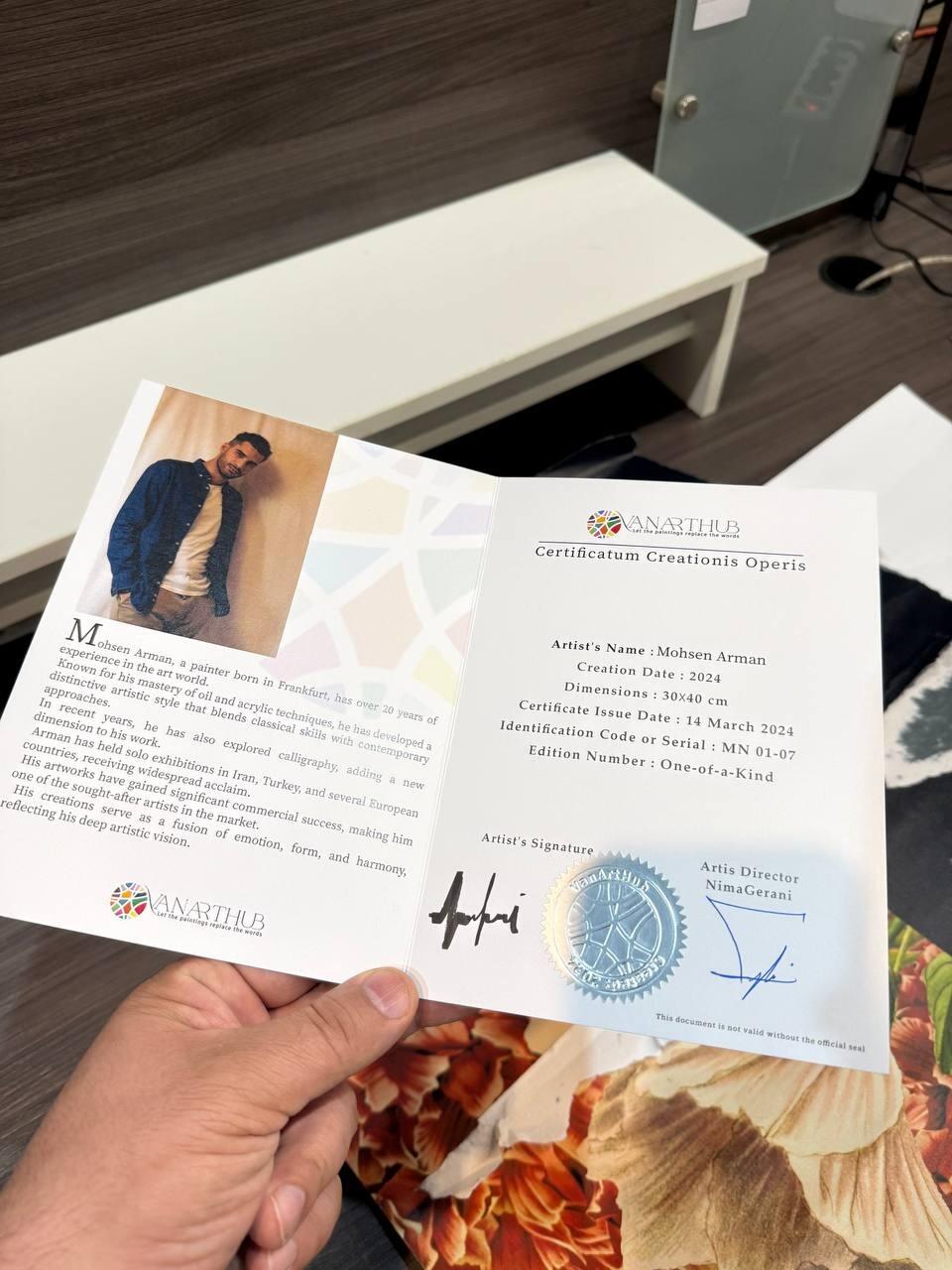
Originals only. Every piece on the site is a one-of-a-kind work, signed by the artist, and once it sells nobody can buy that exact painting again. We do not sell prints, giclees, or reproductions of any kind.
About VanArtHub
VanArtHub is an online gallery in Vancouver selling original, signed, one-of-a-kind paintings by independent artists. No prints and no reproductions. Every piece ships with a Certificate of Authenticity, free fully insured delivery to Canada and the USA, and a 14-day trial so you can decide at home. Browse all available originals or abstract paintings, and read why we offer a 14-day trial. Our full policy lives on the Buy with Confidence page.