Modern interiors are unforgiving in a specific way. There is less in the room, so everything in it is more visible, and a frame that would disappear in a busy house becomes a significant object in a spare one.
The instinct is to go minimal on everything. That is half right. The frame should be quiet; the space around the artwork should not be small.
Narrow frame, generous border
This is the combination that works, and it is worth stating plainly because people usually get one of the two.
The frame goes narrow. A slim flat profile, a reverse profile, or a narrow metal section. Between about 10 mm and 25 mm covers most modern framing. The moulding is functioning as a boundary, not as decoration.
The mat goes wide. Wider than you would use in a traditional room. The empty field around the image is what gives a work presence in a room that has no other visual support to offer it. See mat border width guide.
What does not work in a modern room is a narrow frame and a narrow mat. It reads as economising, and in a spare interior there is nothing else nearby to distract from that.
Materials that belong
-
Matte black. The safe answer, particularly in metal, and it stays out of the way in almost any modern palette.
-
Natural pale wood. Ash and maple both work. They add warmth without adding period. See natural wood frames.
-
Brushed metal. Cool and precise, excellent against concrete, steel and glass.
-
White or bone. Effectively invisible on a white wall, which lets the artwork sit as pure image.
Avoid: gold, ornate profiles, carved detail, and anything with a decorative inner lip. Not because they are bad, but because they carry a period with them and it is not this one. See gold and ornate frames for the exception, which is one deliberate gilded frame used as a single confident gesture.
The frameless option
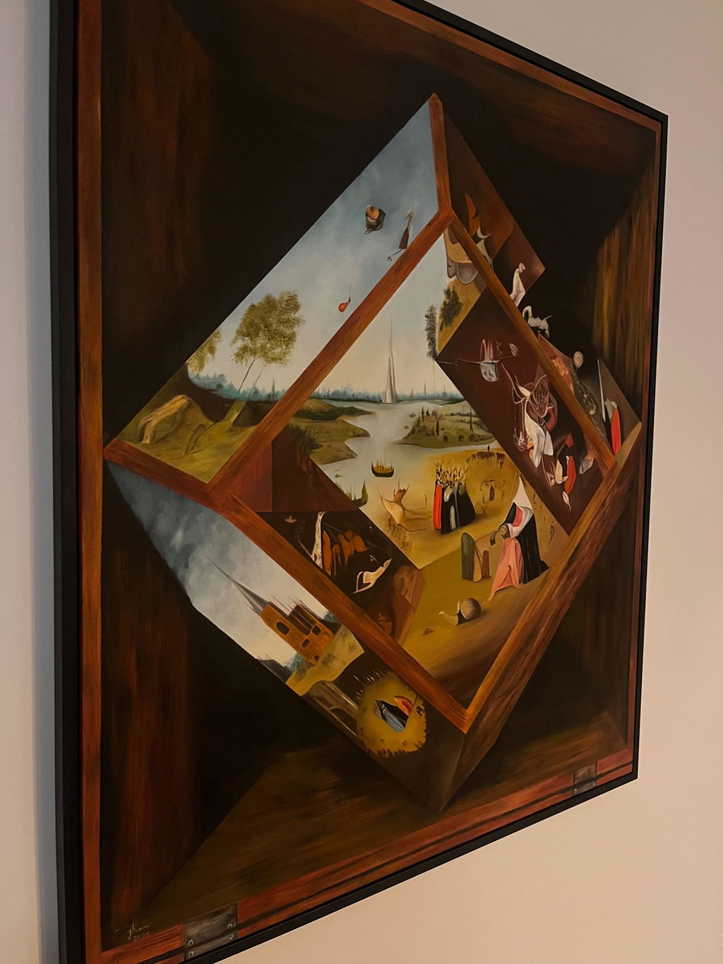
Modern interiors are where a bare gallery-wrapped canvas genuinely belongs. No frame, no glazing, just the painted object on the wall. A piece like Echoes Within hung bare in a spare room is a modern gesture in a way no framed version of the same painting would be.
This only works when the canvas has finished edges and enough depth to read from the side. See frameless and gallery wrap.
Where modern rooms go wrong
Hanging too high
Modern rooms often have taller ceilings, and people compensate by hanging art higher. Ceiling height does not change eye level. Centre at about 145 to 150 cm regardless, and let the empty wall above the picture be empty. It is supposed to be.
Too small for the wall
Large open walls need large work or a group. A single modest painting on a wide expanse of white looks like a placeholder. If the piece is small, put it somewhere the wall is in proportion to it. See framing small paintings.
Everything matching
A modern room full of identical black frames can tip from coherent into corporate. Keeping the frames consistent but letting the works vary in size and character is what keeps it feeling like a home.
Ignoring glare
Modern interiors have large windows and hard surfaces, so there is a great deal of light bouncing around. This is the interior style where anti-reflective glazing earns its cost most often. See anti-reflective glass.
Wall colour
Most modern walls are white or near-white, which is the hardest background for a white frame and the easiest for a dark one. On a warm white wall, a cool white frame will look grey; on a cool white wall, a warm frame will look cream. If the frame is going to be pale, it is worth holding a sample against the actual wall rather than trusting a name on a chart.
Avoiding a showroom look in a lived-in modern home
Modern interiors lean toward clean lines and minimal ornament, and that same restraint can tip into looking like a furniture showroom rather than a home someone lives in, if every piece on the wall follows the same rule with no variation at all.
The tell is uniformity taken too far: identical black or white frames, identical widths, identical spacing, on every wall in the house. That consistency is correct for a single gallery wall, but applied to an entire home it reads as staged rather than collected, since a home built up over years rarely has every piece the same width and colour.
The fix is small, deliberate variation rather than abandoning the modern frame vocabulary altogether. Keep the frame family consistent, slim profiles, neutral colours, minimal ornament, but let width, tone, or material shift slightly from room to room: a narrow black metal frame in the hallway, a slightly wider dark wood frame in the living room, a floater frame on a canvas in the study. Each stays within the modern language but the small differences are what make the house read as lived-in rather than furnished all at once from one showroom.
Mixing in one piece with real texture, a heavier impasto painting in a simple floater frame, or a piece with a visible reveal and mat rather than frameless glass, also breaks the showroom flatness without breaking the modern feel, since texture and depth read as personal in a way that uniform flat black frames on white walls do not.
Common questions
Do modern interiors suit unframed work?
Canvases, yes, if the edges are finished. Works on paper, no. That is a conservation matter rather than a style one: unframed paper is unprotected paper, whatever the room looks like.
Should I use the same frame throughout a modern home?
It is a reasonable default and it makes a collection feel considered. Do allow exceptions where a piece genuinely needs something else. A rule followed past the point of sense produces rooms that look furnished rather than lived in.
Is a mat necessary in a modern frame?
For a work on paper, something has to hold the glazing off the surface, so it is either a mat or a spacer. A float mount with a spacer gives you the very minimal look with no visible border, and it is a common modern choice. See framing works on paper.
What frame width suits a modern interior best?
Narrow, generally, since modern interiors tend to favour clean lines and minimal visual clutter. A profile in the 1 to 3 cm range, or a floater frame with a slim visible edge, reads as considered rather than heavy. Wider mouldings can still work but usually in a plain, unornamented finish.
Does black or white read as more modern?
Both do, and the choice usually comes down to the wall behind it rather than one being inherently more modern than the other. Black gives sharper definition and suits light, bright rooms; white lets the frame recede and suits rooms that already have strong colour or texture elsewhere.
Can metal frames look too industrial for a modern living space?
They can, if the finish is raw or unfinished, but a properly finished anodized or powder-coated metal profile reads as sleek rather than industrial in most modern rooms. The effect depends heavily on the specific finish, so seeing a sample against the wall colour is worth doing before deciding.
Is a completely frameless canvas the most modern option?
It is one strong option, particularly for a large statement piece, but it is not the only modern choice. A slim floater frame in black or natural wood is equally at home in a modern room and adds a small amount of protection and definition a bare canvas does not have.
Does a gallery wall still work in a minimalist modern space?
Yes, if the frames are kept consistent and the spacing is precise, since a minimalist room tolerates a group of art more easily when it reads as one deliberate arrangement rather than a scattered collection. Uniform frame colour and even spacing matter more here than in a more eclectic room.